Warm Peach and Terracotta Tones: How to Use 2026's Coziest Color Palette at Home
Discover how to decorate with warm peach and terracotta tones using 2026's coziest color palette to create inviting, stylish, and comfortable living spaces.
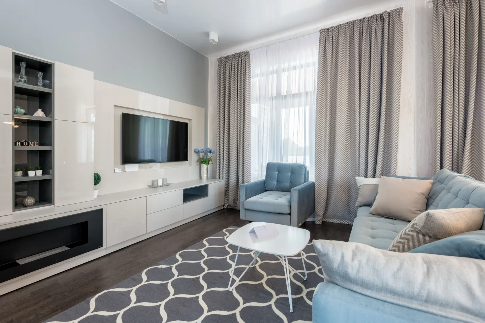
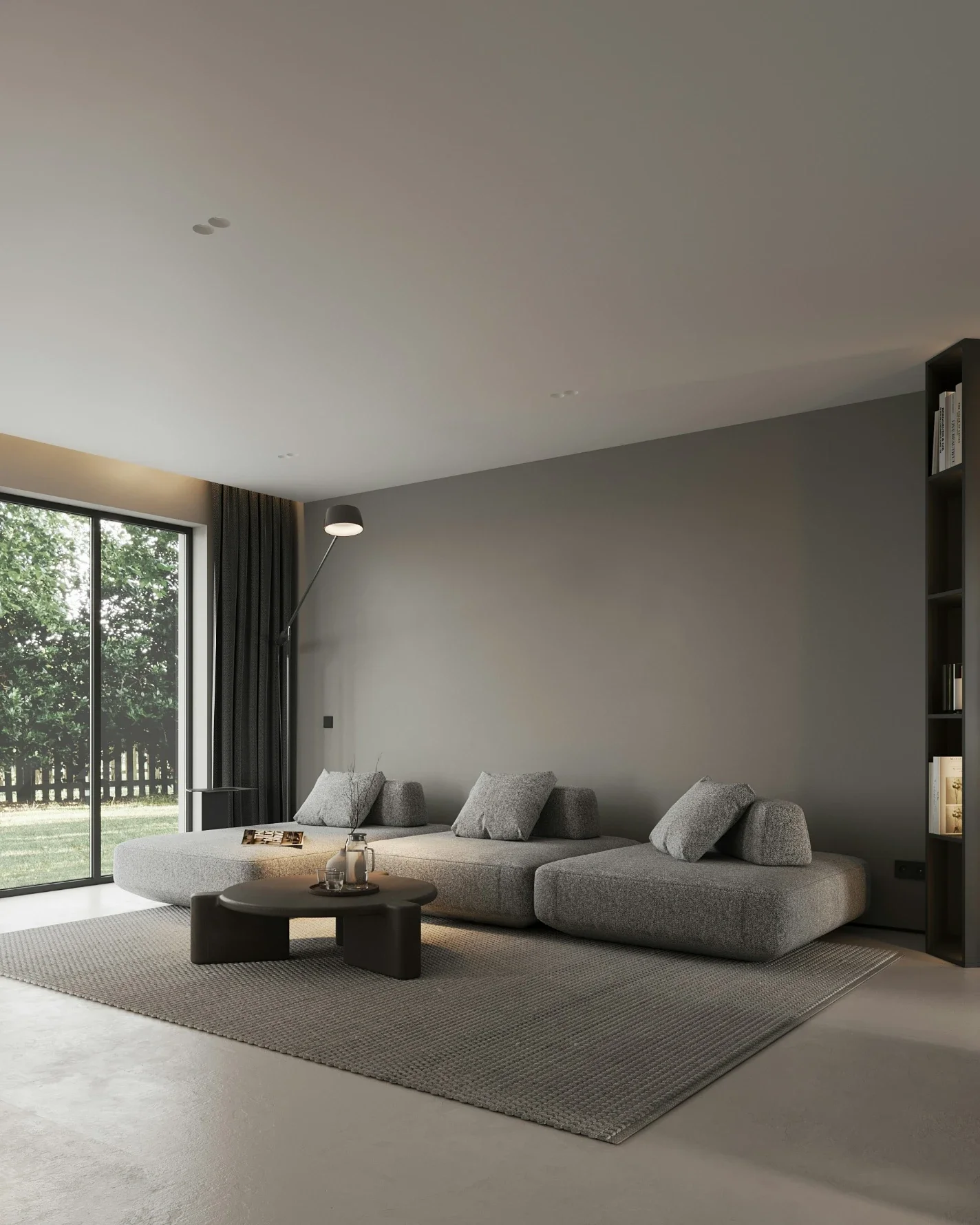
Walk into a house painted in the last ten years and odds are you'll find gray. Gray walls, white trim, maybe a greige hallway if things got adventurous. It looked clean in the listing photos. Living in it is another story. A lot of those rooms just feel cold.
That's shifting now, and quickly. Homeowners are asking for peach, terracotta, clay, apricot. Warm stuff. Colors you'd find in a spice drawer, or on an old clay pot that's spent a few summers outside. You don't need a study to know why rooms like that are easier to relax in, though there is one, and we'll get to it. Painters see the shift up close. Ask a crew like Peach Painting what homeowners are requesting lately and warm earthy tones come up again and again.
Why everyone's craving these colors right now
Some of this is just fashion doing what fashion does. Designers across the country report that terracotta and clay tones are trending in 2026, and they keep reaching for the same partners: natural wood, woven textures, creamy neutrals.
There's a second reason, though, and it's a strange one. Your brain reads warm colors as literal warmth. One study put people in rooms with different colored lighting and asked how warm they felt. The group in the warm-lit room said they feel physically warmer than the group in the cooler-toned room. The funny part? The cooler room's thermostat was actually set a degree higher. So no, you're not imagining it. Paint a room in peach or clay and you're nudging how the room feels on your skin.
Getting the shade right
Here's where these colors reward a little patience. Peach isn't one color. Neither is terracotta. Each swings wildly depending on its undertones.
Peach with too much pink reads like a nursery. Peach with a drop of brown or yellow reads sophisticated, almost like a warm neutral. Terracotta is the same story. Too orange and it shouts. Softened with brown and a whisper of gray, it settles down into something you could live with for a decade.
Light changes everything, too. That muted apricot on the chip can glow neon at 4 p.m. on a west-facing wall. So test big patches, in the actual room, and watch them for a few days. Morning, noon, lamplight. The color that looks good in all three wins.

Room by room: where each tone shines
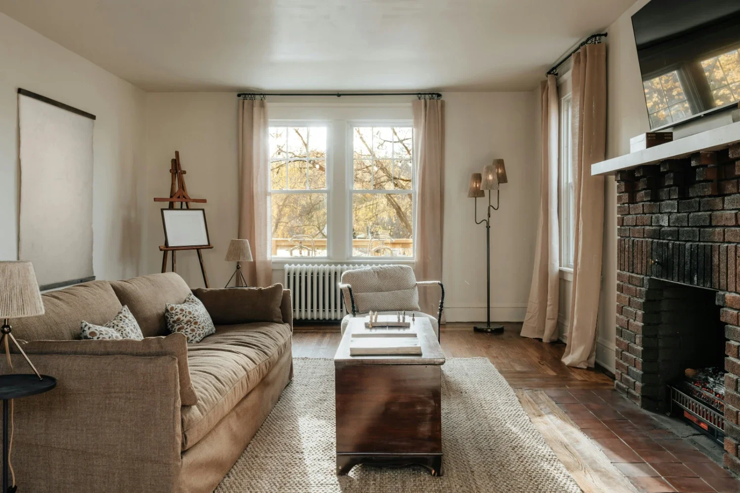
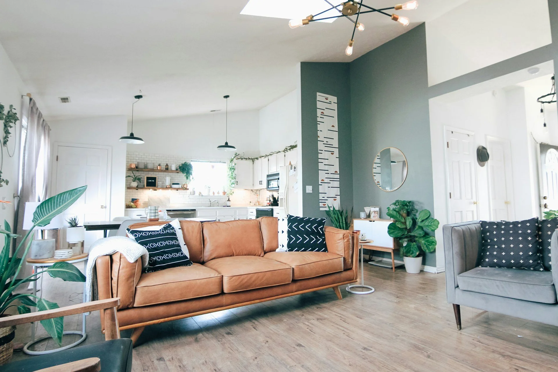
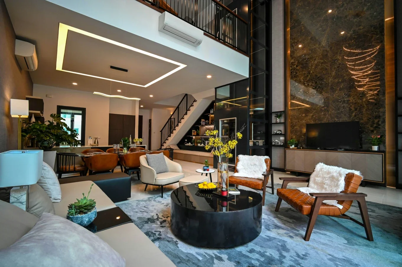
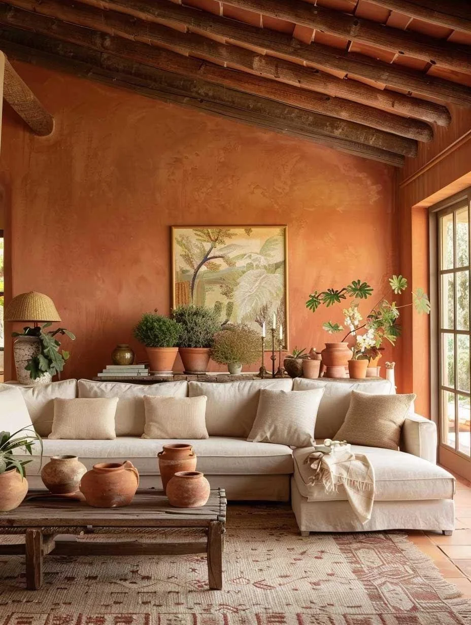
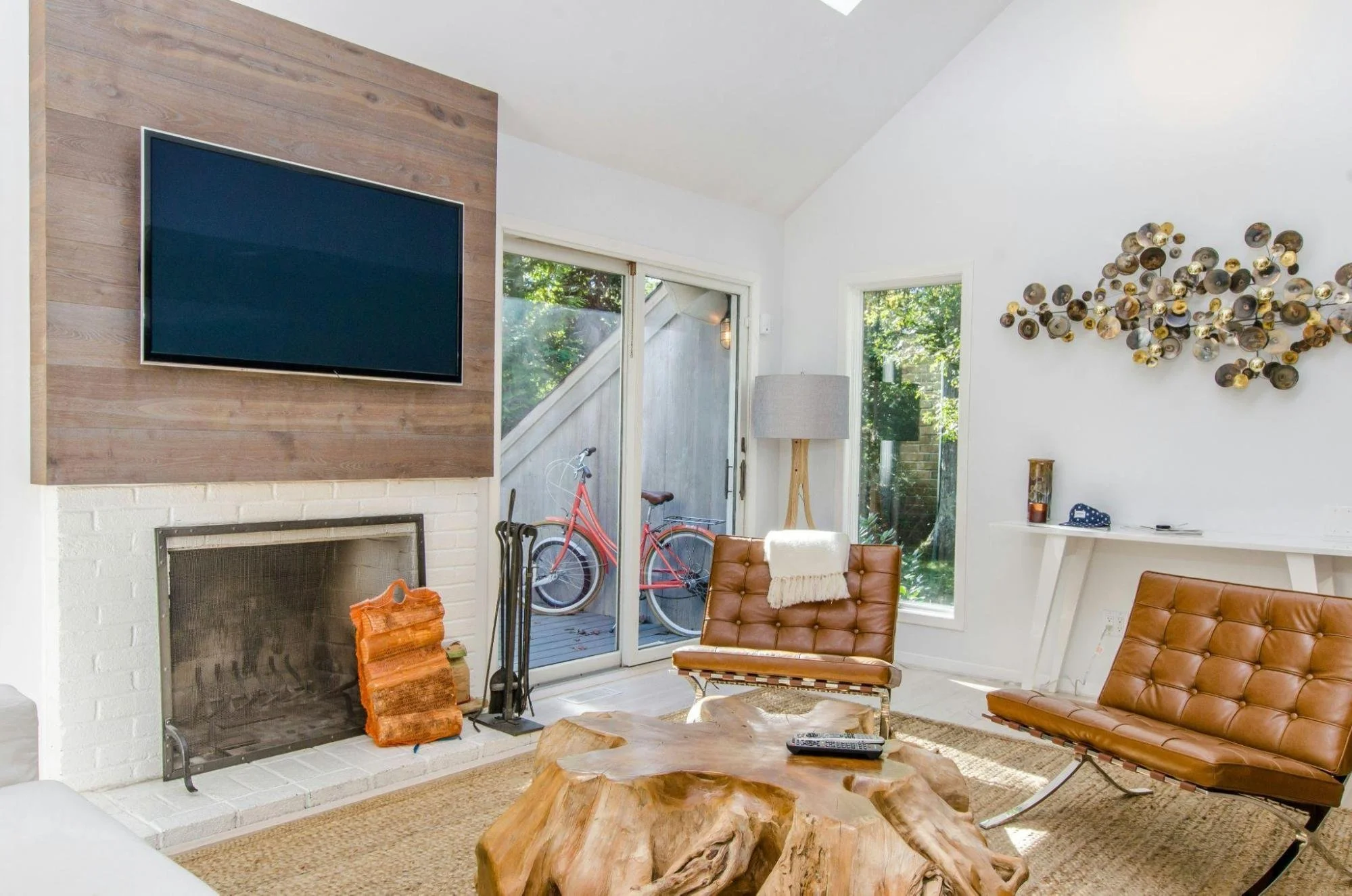
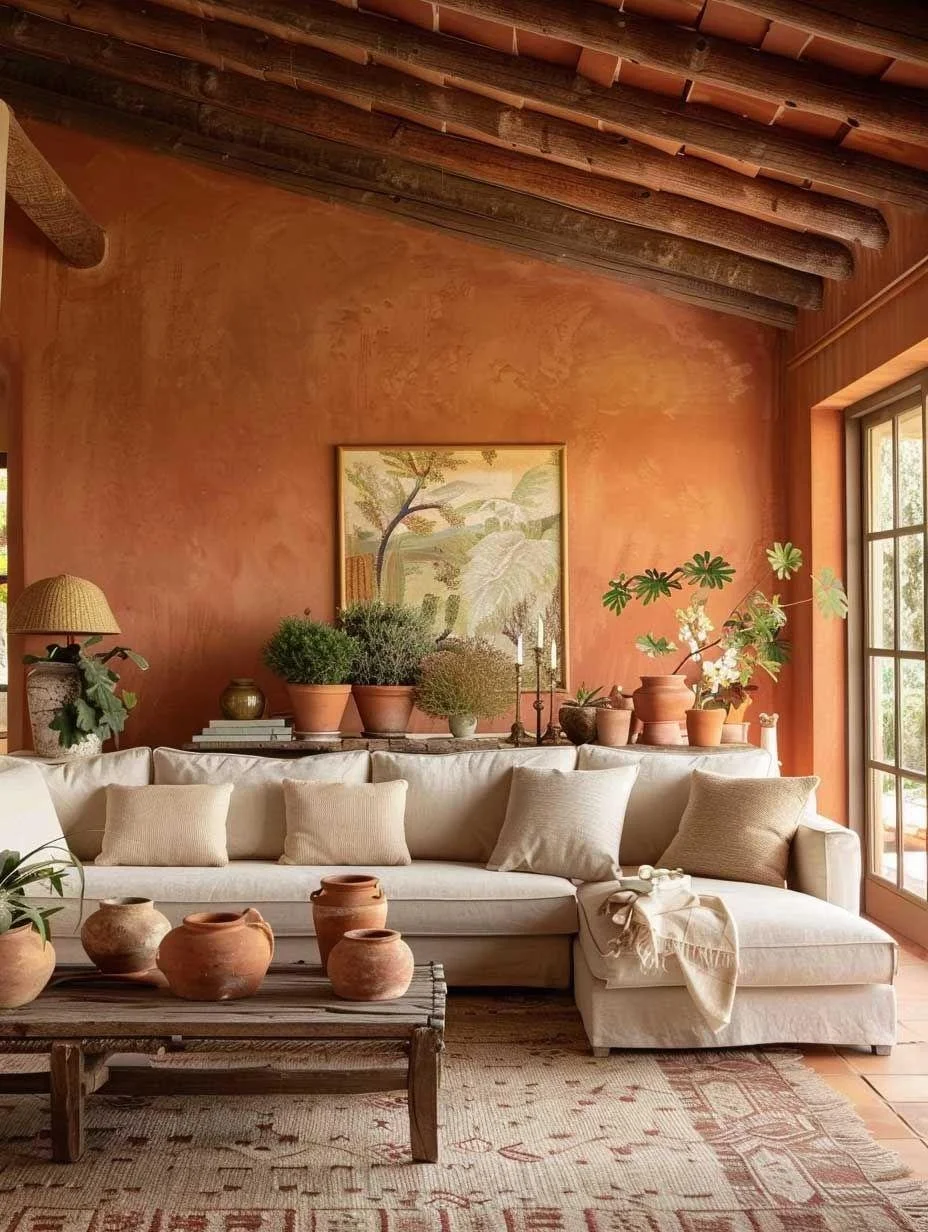
For living rooms, go deeper. Terracotta, clay, a soft rust. You get depth without the cave effect, and any wood furniture in the room suddenly looks about twice as expensive. No new couch required.
Peach belongs in the bedroom. Go for the softer, muted versions here. They're calm and warm at the same time, and famously kind to skin tones in lamp light. You will simply look better in a peach bedroom. That's just physics.
Kitchens might be the sleeper hit. Design editors point out that terracotta works on cabinetry beautifully, where a color that might overwhelm four walls becomes a warm, grounded accent on lowers or an island.
And don't sleep on small spaces. A powder room, an entry, a hallway nook. Wrapping a tiny room in warm clay turns "cramped" into "cocooned."

Pairings that keep it grown-up
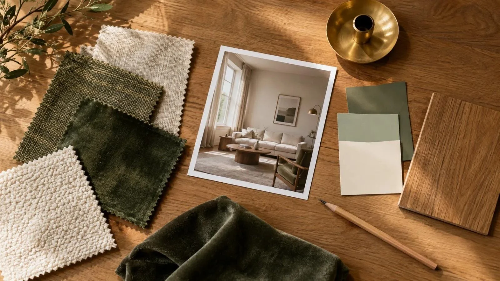
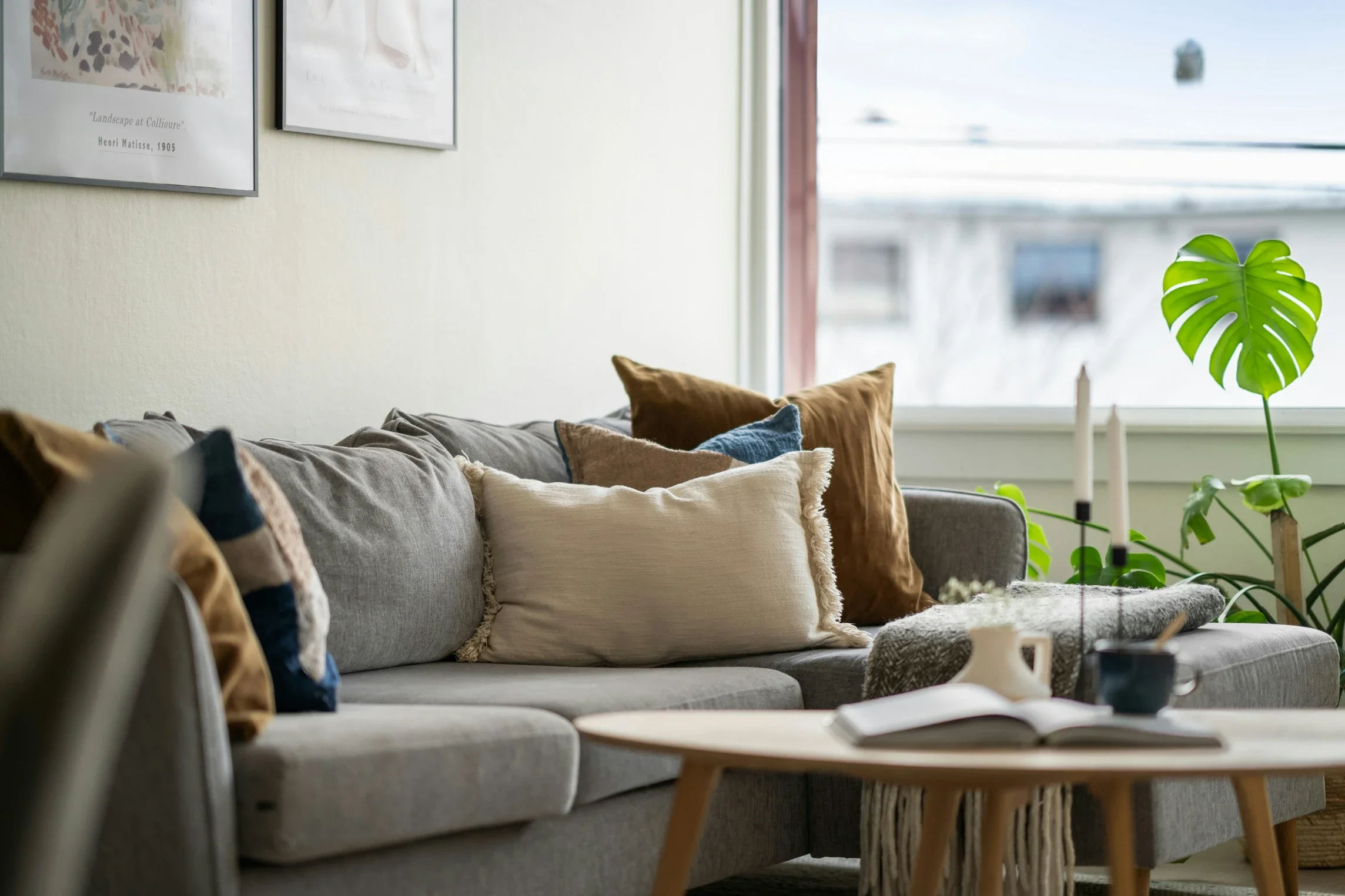
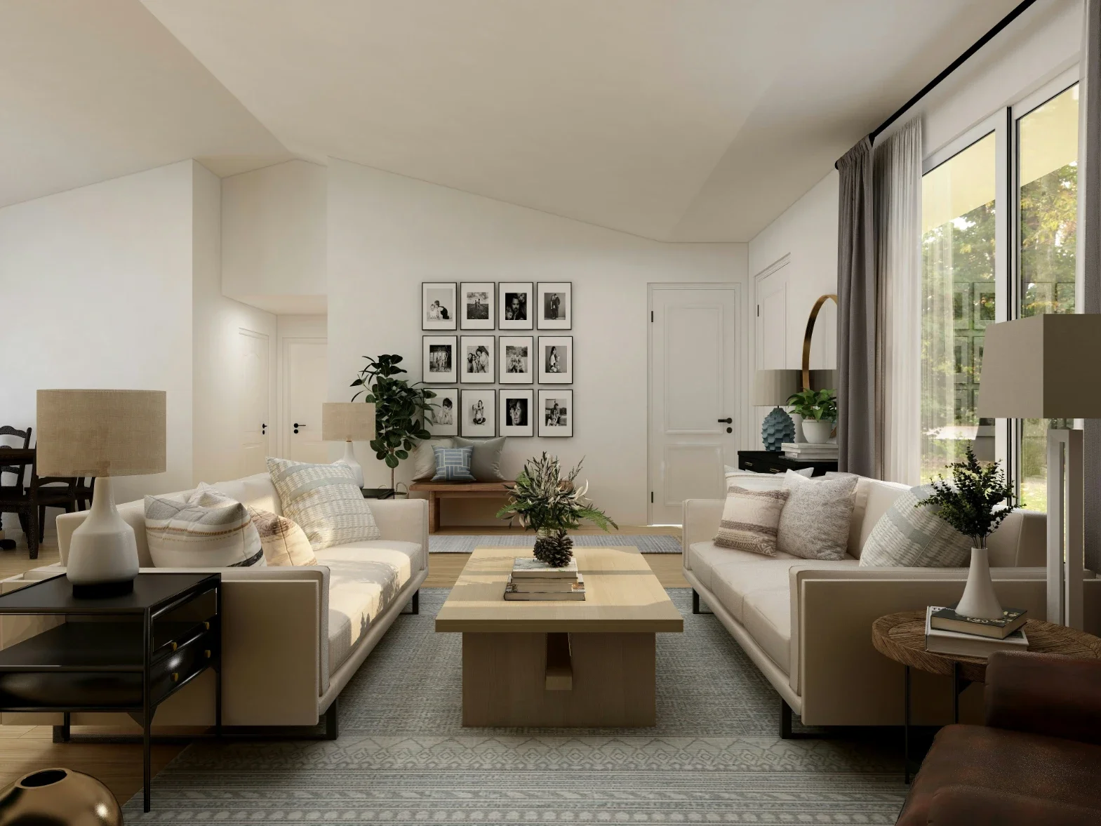
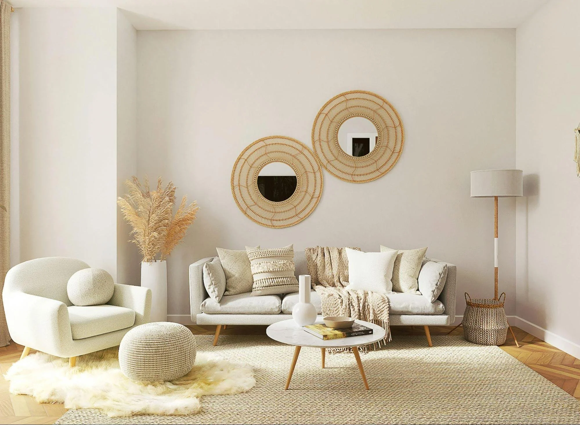
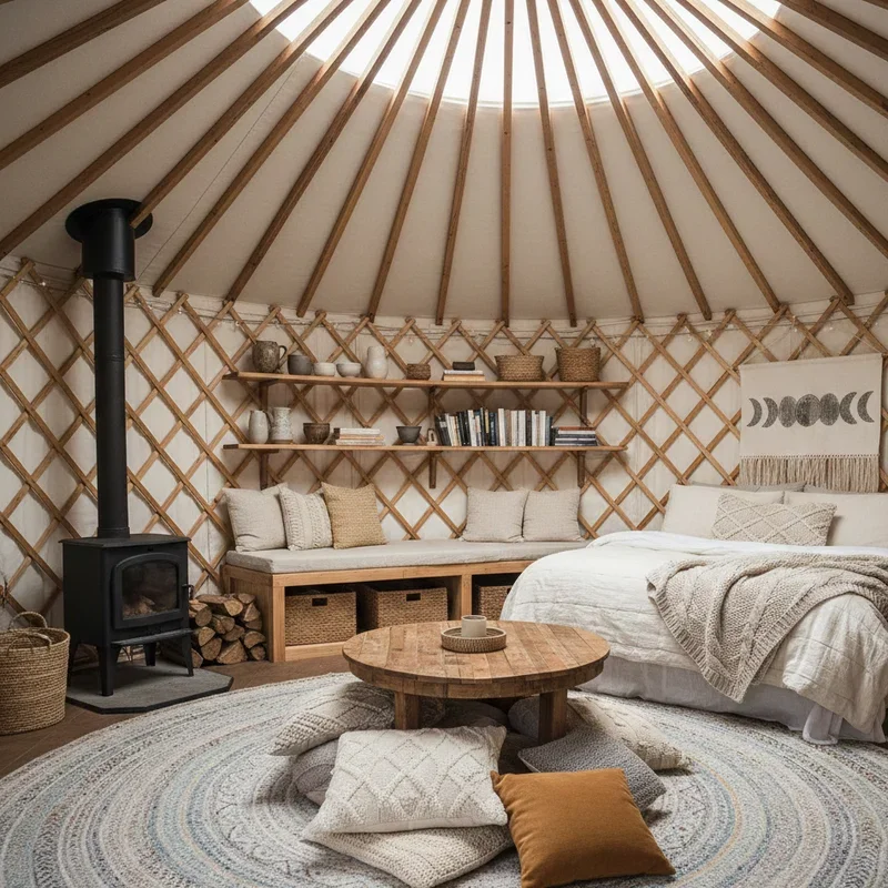
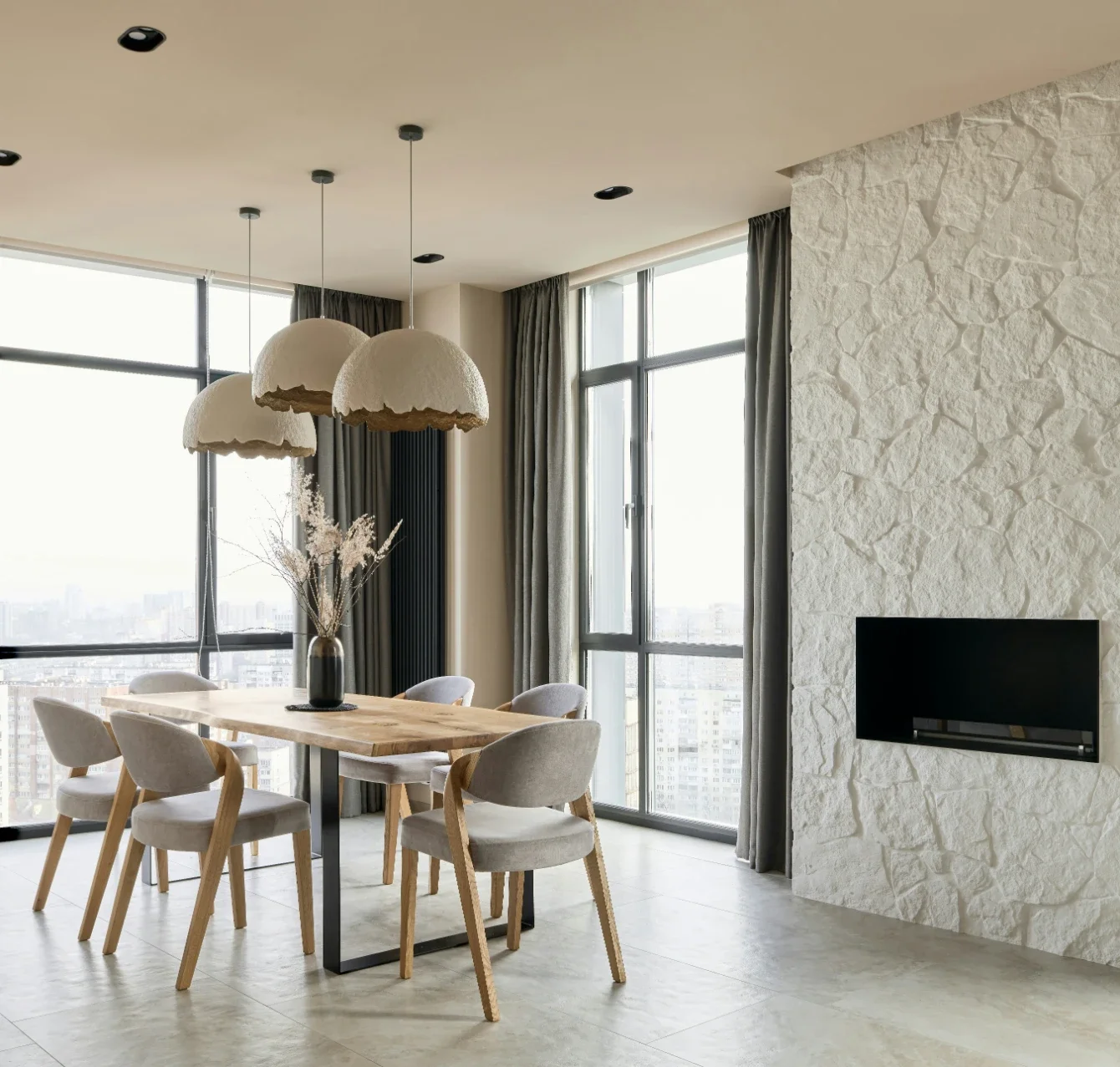
The fastest way to make peach or terracotta look expensive is what you put next to it. Swap stark white for something creamier. Let wood, rattan, and linen do the texture work. Then give all that softness a little backbone, maybe a black picture frame or a bronze lamp. Want actual contrast? Sage and olive sit right across the color wheel from these tones, and they calm everything down the moment they walk in.
What to avoid: pairing these warm tones with the cool grays they're replacing. The gray goes muddy, the peach goes off. Pick a side.

Nervous? Start small
You don't have to commit to the whole house to try this. Do one wall behind the bed or the sofa and see how you feel about it in a month. Or paint the ceiling a soft apricot. Sounds odd, looks like a glow, and guests won't be able to put their finger on why the room feels so nice. The back of a bookcase works too. So does a terracotta front door, which somehow never goes out of style even while it's in style.
Bigger plans are a different animal. Whole rooms, cabinets, or drenching walls and trim in a single shade all take real prep, and these saturated colors hide nothing. Every roller mark shows. That's when it pays to talk to a crew like Peach Painting. They work with these warm tones week in, week out, and they'll know which terracotta stays terracotta on your sunniest wall instead of sliding into orange.
Maybe cozy was never really a trend at all. We spent years in cool gray boxes and finally admitted we didn't like them much. The warm stuff was waiting the whole time.
FAQs
Is peach too sweet for a main living space?
Only if you grab the bubblegum version. The muted peaches, the ones with a bit of brown or gray mixed in, act more like warm neutrals than pink. Nobody walks into those rooms thinking nursery.
Will terracotta make my small room feel smaller?
Darker, sure. Smaller is a different question. A deep warm color can make a tiny room feel like it was meant to be tiny, which beats pretending it isn't. Keep the ceiling light and hang a mirror if you're worried.
What colors go with peach and terracotta?
Creamy whites and warm beiges are the safe bets. Wood in almost any tone. Sage or olive if you want contrast. A little black or bronze keeps it all from going soft. The one thing to skip is cool gray, which argues with the warmth and loses.
Do these tones work in a north-facing room?
That might be their best room in the house. North light runs cool and flat, and a warm wall pushes back against it. One tip: pick a shade a notch warmer than you think you need, because that flat light will mute it.
Do I have to repaint everything to try the trend?
No. One wall, one door, a ceiling, a run of cabinets. Any of those gets you the effect. Live with it for a season, and if you still love it, keep going.
Stay up to date with our latest ideas!