What Colors Should I Paint My House? A Practical Guide to Choosing Exterior and Interior Paint
Learn what colors to paint your house with practical tips for choosing exterior and interior paint that suits your home's style, light, and surroundings.

What Colors Should I Paint My House? Start Here
There is no single right color for your house. The best answer comes from working in order: start with what is already fixed (roof, brick, siding, floors), then account for light, architecture, climate, resale goals, and finally your own taste. If you are standing in front of a fan deck and the choice starts to feel overwhelming, that order is what turns hundreds of paint colors into a short list you can actually act on. It also keeps the painting project from stalling before it starts, because you are no longer judging every chip against every other chip.
Two ideas shape everything that follows. First, exterior and interior color are different problems with different constraints, so decide which one you are solving before you pick anything. Second, paint should be built around the materials you are not changing, not chosen in a vacuum. This guide walks through the exterior palette, architectural fit, climate and durability, how to test colors with paint samples, interior planning room by room, resale considerations, and when a painting job calls for a pro.
Step One: Build Around What Isn't Changing
Paint is the cheapest thing on your house to change, so it should adapt to the expensive things that are staying put. Before you look at a single color, take stock of the fixed elements:
Roof shingles or tile
Brick, stone, or masonry veneer
Existing siding you're keeping
Gutters, downspouts, and window frames
Flooring, cabinets, and countertops (interior)
Mature landscaping and hardscape
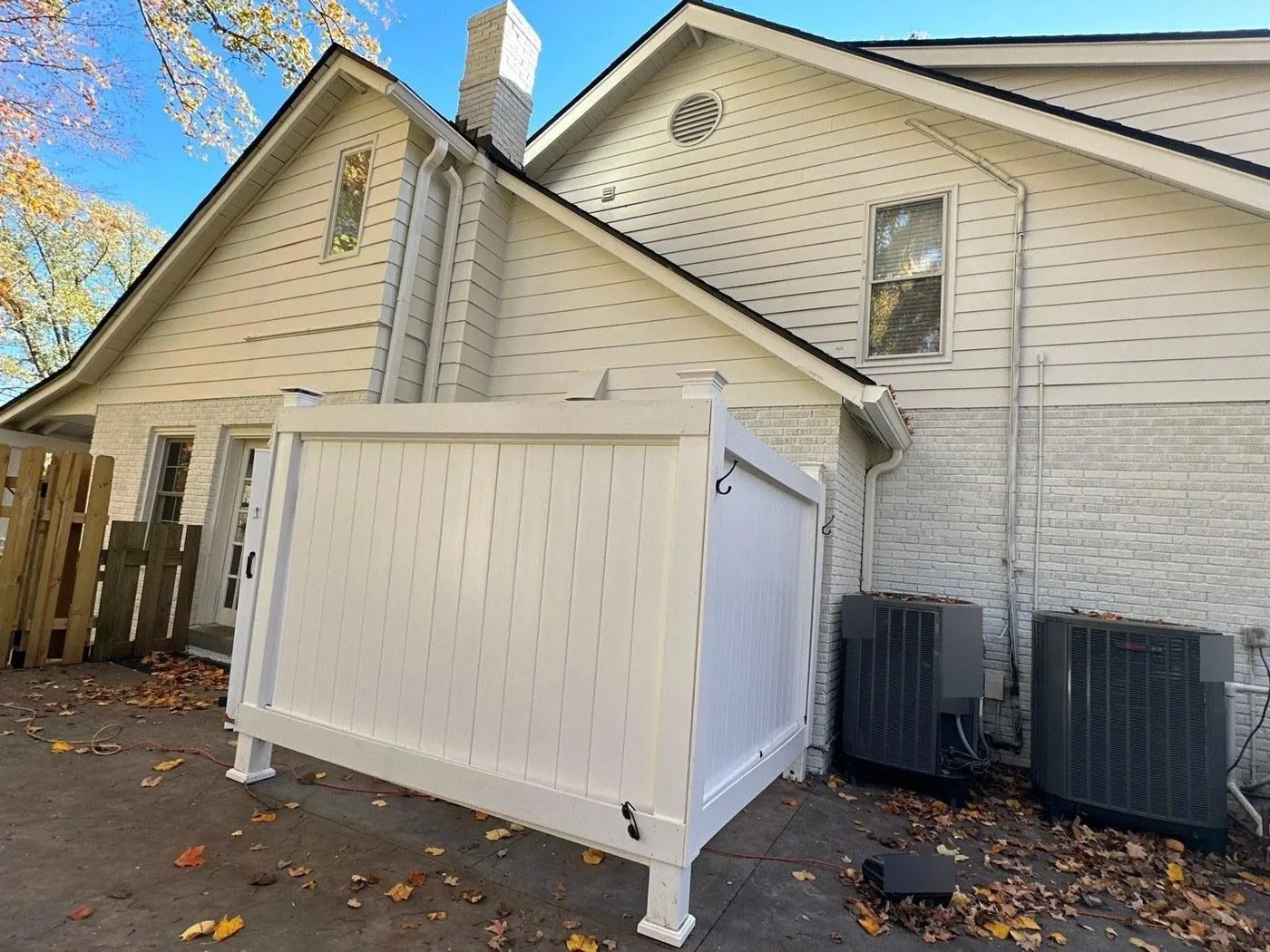
Each of these carries an undertone, warm or cool, that your paint colors either agree with or argue against. A red brick base leans warm, so a cool blue-gray body can look off, or plain wrong, against it. A charcoal roof reads cool, which is why it plays well with crisp whites and gray-blues. Even a hint of pink or peach in an aging brick wall can throw off a neutral that looked perfect on the chip, so study the material in daylight before you shortlist anything.
This is why a flexible neutral is the safest anchor for most homes. A soft greige works with mixed materials because it bridges warm and cool. Light taupe or a clay beige adds warmth and depth without committing to a strong hue, so a single neutral shade can sit comfortably next to stone, wood, and metal fixtures at the same time. Matching undertones is the thread that runs through every decision in this article, so it's worth training your eye on it now. Once you can spot whether a shade leans warm or cool, the rest of the process gets far less intimidating.
How the Three-Color Rule Structures an Exterior Palette
A good exterior palette almost always uses three roles, and naming them keeps you from selecting colors at random.
Body color: the main siding or stucco, the largest surface by far.
Trim color: fascia, window trim, corner boards, and porch columns.
Accent color: the front door, shutters, railings, and small architectural details.
The body sets the tone, the trim frames it, and the accent gives the house a point of interest. Off-white is the most popular trim color because it flatters nearly every body shade and never fights the roof. You can go lighter or darker than the body, but contrast is the goal: light body with dark trim reads sharp, dark body with light trim reads classic.
Classic combinations tend to have the broadest appeal because they've been tested by decades of houses that still look good:
White body, warm taupe trim, black door
Sage body, cream trim, stained wood door
Greige body, charcoal trim, deep green door
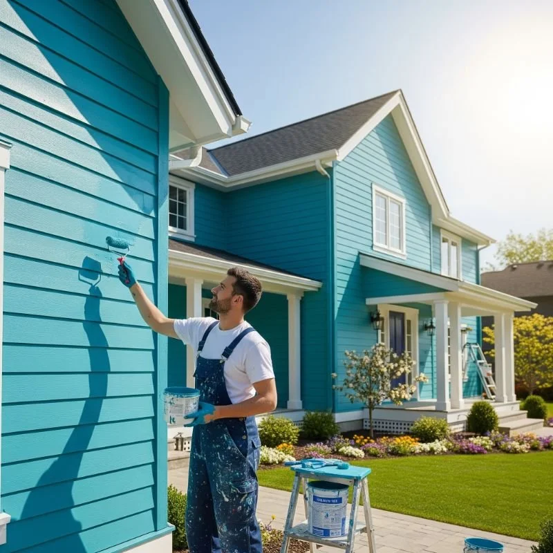
Blue-gray body, white trim, navy or red door
Tan or stucco body, bronze trim, terracotta accents
Pick the body first, let the trim color support it, and save the boldest move for the accent, where a strong color covers the least square footage and costs the least to repaint later. These combinations are a starting point for inspiration rather than a rulebook, so treat them as ideas to adapt to your own materials and setting.
Which Exterior Paint Colors Suit My Home's Architecture?
Architectural style narrows the field before personal style enters. Craftsman and cottage homes wear blue-gray, slate, and smoky blue well, along with earthy greens that echo their handcrafted roots. Colonials suit restrained palettes: warm whites, soft grays, and classic pairings with dark shutters. Ranch houses take warm neutrals and sage comfortably, and their long horizontal lines look good with tan or clay. Modern homes lean into charcoal, black, and stark white with minimal trim contrast for a contemporary feel. Modern farmhouses built the recent white-and-black look popular, though warm whites and creams age better than pure white.
Setting matters as much as style. On a tree-lined lot, sage and olive let the house settle into the greenery. Near water, blue-gray and slate feel right at home. In desert, Spanish, and Mediterranean parts of the country, clay, terracotta, and warm brown reflect the natural materials around them. Scale plays a part too: lighter colors make a small house feel larger, while darker colors make a big house feel more grounded and cozy. Warm hues read as inviting, cool hues as clean and crisp. Trust your own sense of the neighborhood here, because a color that fits the block usually feels right on the house too.
Do HOA or Historic District Rules Affect My Choice?
Sometimes the decision isn't fully yours. Many HOAs maintain an approved palette and require sign-off before you paint. Historic districts go further. Cambridge, Massachusetts, publishes exterior paint color guidance for historic buildings through its historical commission, and New Orleans' Vieux Carré Commission requires submitting paint chips for exterior work in the French Quarter. Check your local rules before you buy a single gallon, because repainting to comply is an expensive mistake.

How Roof Color and Fixed Exterior Elements Guide the Palette
Your roof is the second-largest surface on the house and it isn't changing anytime soon, so it should steer the body color. Match undertone to undertone. Gray and black roofs pair naturally with cool grays, blue-grays, charcoal, and crisp whites. Brown and tan roofs call for warmer companions: greige, tan, sage, and clay.
If you want drama, a deep navy or charcoal gray body under a matching dark roof can create a striking, cohesive look, especially with bright white trim to keep it from feeling heavy. Bring the same discipline to gutters, stone, and window frames. When the paint agrees with the fixed elements instead of ignoring them, the whole house reads as intentional.
Climate, Sunlight, and Durability: Do They Change My Color Choice?
Exterior color does real work beyond looks. Lighter, more reflective surfaces reduce heat gain in hot, sunny climates. The EPA's cool-wall guidance notes that white, light-colored, or specially pigmented products can perform functions similar to cool roofs, and Lawrence Berkeley National Laboratory has shown that raising a wall's solar reflectance lowers its surface temperature and cuts daytime heat flowing into the space behind it.
Dark colors demand caution on certain substrates. On vinyl siding, dark paint can absorb enough heat to warp the panels. Benjamin Moore's technical guidance warns against painting vinyl darker than the original or below certain LRV thresholds unless you use an approved vinyl-safe palette, and Sherwin Williams similarly notes that dark paint absorbs heat and transfers it to the substrate. Both Sherwin Williams and Benjamin Moore publish vinyl-safe collections for exactly this reason, so ask for one by name if your siding is vinyl. Unpainted brick and masonry carry their own risk: the National Park Service cautions that non-permeable coatings can trap moisture inside the wall and accelerate decay, so painting bare brick is often a one-way decision you may regret.
Surface prep, moisture testing, primer, and the correct coating system matter as much as the color you land on. Industry specifications like MPI's exterior painting guide exist precisely because finish quality depends on the system, not the shade. In damp or variable-weather regions, comparing written scopes from local contractors helps. Seattle-Tacoma homeowners, for example, might review a provider such as coverpropainting.com alongside other licensed painters to understand prep, primer, and scheduling recommendations for a wet climate.
How to Test Paint Samples in Different Finishes and Lighting Before You Commit
Sampling correctly is the single best way to avoid second-guessing after the crew has left. Work through it in steps.
Step 1: Narrow your options to six or eight colors. More than that and you'll stall.
Step 2: Use large peel-and-stick paint samples or brush generous swatches onto poster board, not the tiny chips. A two-inch chip lies about how a color reads across a whole wall.
Step 3: Look at the samples in morning, afternoon, and evening light, on both sunny and cloudy days. Move them to different walls, and try different finishes if sheen matters for the room.
Step 4: Trust what you see over the crowd. Asking a dozen friends usually adds noise, not clarity.
Both Sherwin Williams and Benjamin Moore sell peel-and-stick color samples, and the Sherwin Williams stick samples are handy because you can move them from wall to wall without brushing anything on. Benjamin Moore recommends brushing on samples specifically because natural and artificial light change how undertones read, and Sherwin Williams offers the same undertone advice. A greige that looks warm at noon can shift depending on the bulb, turning faintly purple or even slightly pink under an evening light. Give each color a full day cycle before you decide, and view exterior samples against the roof and trim they'll actually live next to. Cheap stick samples cost far less than the paint and labor you save by catching a bad shade early.
Choosing Interior Paint Colors: A Whole-House Palette First
Inside, separate two ideas: the whole-house neutrals that flow through hallways and main living areas, and the room-specific colors that bring personality. A cohesive home usually runs on six or seven coordinated hues total, not a different color in every room.
Build the palette outward from your most-used room. Pull a dominant color from that central space, then let quieter versions of it or its companions travel down the hall and into adjoining rooms. Repeating the same color in a softened form keeps rooms connected without making them feel identical. This Old House offers a smart starting point: choose an object, fabric, or piece of art you already love and let its colors guide the palette rather than grabbing a random chip. A favorite rug or throw pillow is a reliable source of inspiration because it already pairs shades that work together. Paint is the last thing you buy, not the first, so it should follow the furniture, flooring, and finishes already in the room.
Reliable whole-home neutral families include:
Warm white and cream, brighter than a room but softer than stark white
Greige and taupe, flexible with wood, stone, and mixed metals
Pale blue and blue-gray for relaxed spaces
Soft sage and gray-green, calming and now firmly mainstream
If the choice feels paralyzing, the color experts at any major paint counter can help you match a hand picked collection to your flooring and cabinets, and Sherwin Williams and Benjamin Moore both stage curated palettes online that group popular colors into ready-made schemes. Those hand picked pairings are a shortcut to the right colors when you don't want to build a palette from scratch.
How the 60-30-10 Rule Distributes Color in a Room
A balanced room usually splits color roughly 60-30-10. The dominant color covers about 60 percent, typically the walls. A secondary color takes about 30 percent through larger furniture and textiles. An accent color fills the last 10 percent in pillows, art, or a single painted element. Keeping those proportions stops any one color from overwhelming the space, and it gives even a small room a sense of order that a single flat wall color can't.

Best Paint Colors for Individual Rooms
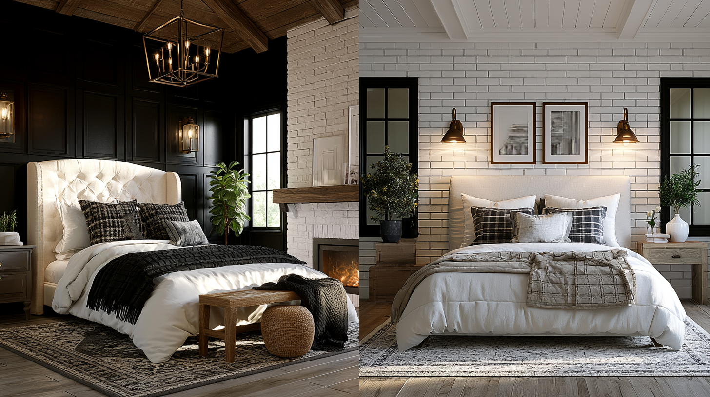
Individual rooms are where you can let a color have an opinion. Cool shades promote rest, which is why pale blue, sage, and soft green suit bedrooms. A bathroom handles pale blue and blue-gray well, reading clean and fresh in a smaller footprint.
The dining room is a good candidate for deeper, moody hues like plum, charcoal, or deep green, because it's often used in the evening under lower light, where saturated colors feel rich rather than dark. A deep green dining room is a great example of a saturated choice that adds depth rather than gloom. Home offices split two ways: quiet neutrals help focus, while a calm blue is a great choice if you want the room to feel steady during long stretches. A powder room is the low-risk place to try something bright or bold, since it's small and easy to repaint if you tire of it. A soft blush or dusty pink can create a warm, flattering glow in a powder room without overwhelming such a compact space, and a splash of yellow in a well-lit spot can add personality where you want a lift.
Whatever the room, remember that lighting and size change how a hue reads. The same sage looks earthy and grounding in a bright room and can feel gray and flat in a dim one, and it won't behave the same way from one house to the next, so sample every room color in the space it will live in. North-facing rooms get cooler light that mutes warm colors, while west-facing walls warm up in the afternoon, and both effects are worth checking before you commit. Painting the ceiling a shade lighter than the walls is a simple move that keeps a small room from feeling closed in.
What House Colors Help With Resale?
The most reliable resale advice is simple: fresh, well-applied paint matters more than any specific color. In the 2025 NAR/NARI Remodeling Impact Report, Realtors recommended painting the entire home before listing more than any other seller-prep project, with 50 percent recommending a whole-home repaint and 41 percent recommending a single interior room.
Zillow's 2026 analysis surveyed 4,000 recent and prospective buyers and found warm, earthy shades performing well in offer-price scenarios. Treat these as buyer-perception research about what potential buyers respond to, not a guaranteed payout:
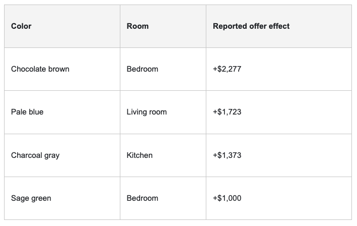
On the other end, the same research found red kitchens and yellow used throughout a home performing poorly. Whites like Benjamin Moore's White Dove read as clean and move-in ready, which is part of why muted hues and soft neutrals help a home stand out to prospective buyers without narrowing its appeal. The safest resale play is warm neutrals, sage, and pale blue, with any moody accent placed deliberately in one room rather than saturated, taste-specific colors spread across the house.
Choosing Paint When It's Part of a Remodel or New Build
If paint is one piece of a larger project, don't choose it first. Wall and body colors should follow, or at least be selected alongside, the full finish schedule:
Roofing and gutters
Siding and stone
Windows and garage doors
Flooring and tile
Cabinets and countertops
Lighting and landscaping
New construction especially needs a coordinated schedule so exterior body, trim color, roofing, and stone read as one plan while the interior palette flows with the cabinets and floors. Design-build firms such as Skyline Design Build, which handles new home construction and remodels across the Sacramento and Bay Area, offer a useful example of how exterior and interior finishes get planned together rather than picked room by room, so the colors complement one another across every surface. On projects like these, color experts often review samples against actual cabinet doors and tile so the walls, trim, and floors all agree before anyone opens a can. Choosing the right colors here is a big decision, and picking a wall color before the counters are chosen is how people end up repainting six months after moving in.
Should I DIY or Hire a Painter?
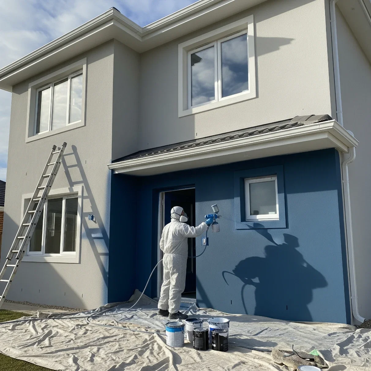
A single interior room is a reasonable weekend DIY. Whole-home exteriors and multi-story work lean toward hiring a pro, mostly because of prep, ladder safety, and getting the weather window right.
Age of the home changes the calculation. Under the EPA's Renovation, Repair and Painting rule, work that disturbs painted surfaces in homes built before 1978 triggers lead-safe requirements once you exceed roughly 6 square feet inside or 20 square feet outside. The EPA advises assuming that paint in pre-1978 buildings is lead-based unless testing proves otherwise. Air quality deserves attention too: most paints emit VOCs during and after application, and the EPA notes that water-based paints generally emit fewer chemicals, so ventilate well and favor low-emission products indoors.
When you do compare contractors, ask each one the same questions and get the answers in writing: surface prep, primer, number of coats, product line, sheen, warranty, insurance, and schedule. Comparing written scopes side by side is the clearest way to see who is actually accounting for the condition of your house, not just quoting a number.
A Simple Checklist for Choosing Your House Color
Run through these questions before you commit, and the shortlist tends to sort itself out:
What fixed colors (roof, brick, stone, floors) must the paint coordinate with?
Is the home in a hot, cold, wet, coastal, or high-UV climate?
What is the siding: wood, fiber cement, stucco, brick, or vinyl?
Is the goal personal enjoyment, resale, or both?
Have you viewed large color samples in morning, afternoon, and evening light, on sunny and cloudy days?
Do HOA, historic district, or lead-safe rules apply?
Is the color appropriate for the substrate (especially dark on vinyl)?
Frequently Asked Questions
What color should I paint the exterior of my house?
Build a three-part palette (body, trim, accent) around your roof and any brick or stone, then match undertones. Warm neutrals like greige and taupe, along with sage and blue-gray, suit most homes and hold up well.
Should my trim be lighter or darker than my house?
Either works as long as there's clear contrast. Off-white trim color is the most versatile because it flatters nearly every body color, while a darker trim like charcoal reads sharper and more modern.
Can I paint vinyl siding a darker color?
Only with caution. Dark paint absorbs heat and can warp vinyl, so use a vinyl-safe formulation and stay above the LRV threshold the manufacturer specifies rather than going darker than the original. Sherwin Williams and Benjamin Moore both offer vinyl-safe lines built for this.
What interior paint colors are best for resale?
Warm neutrals, sage, and pale blue are the best colors for broad appeal, and Zillow's buyer research found small offer premiums for pale blue living rooms and charcoal kitchens. Avoid saturated, taste-specific choices like red kitchens or whole-home yellow.
What exterior paint colors last the longest?
Durability depends more on prep, primer, and the coating system than the color itself, though mid-tone and lighter shades tend to fade less visibly than deep, saturated colors on sun-exposed walls.
Stay up to date with our latest ideas!