How Designers Are Using Wallpaper to Add Personality to Neutral Interiors
Discover how designers use wallpaper to add personality to neutral interiors through bold patterns, subtle textures, feature walls, and creative accents.

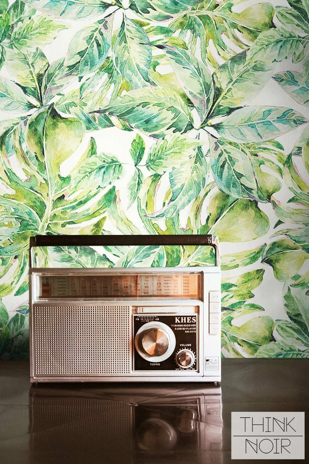
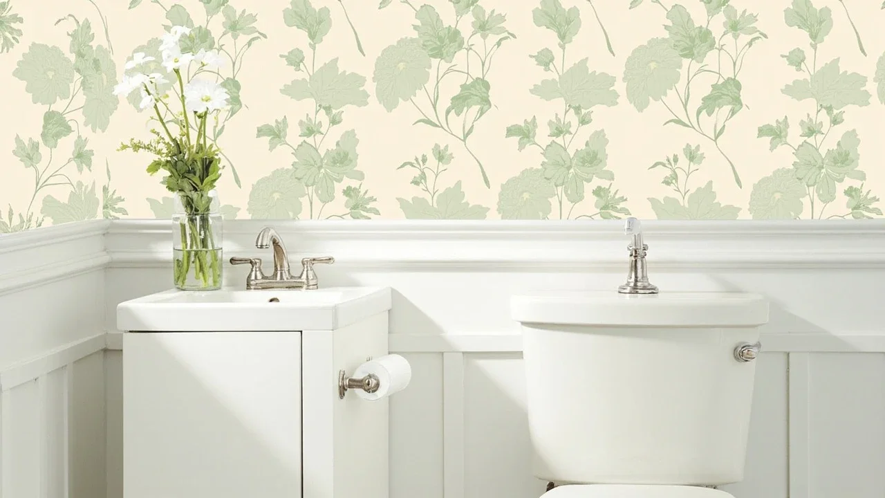
Most people try to fix a flat neutral room by adding more neutral, and that is exactly why it stays flat. The problem was never a shortage of beige or grey. It was the absence of a focal point, and the quickest way designers solve it is with one patterned wall. A soft botanical wallpaper can give a calm, neutral scheme the personality it is missing while keeping everything that made it restful, which is the balance most neutral rooms never manage to strike on their own.
Why adding more neutral makes it worse
Here is the mistake in plain terms. A neutral scheme is popular because it feels safe and calm, and that is precisely why it so often feels unfinished. Strip a room of contrast and the eye has nowhere to land, so a soft palette reads as a blank rather than a backdrop. The instinct is then to add another neutral cushion, another beige throw, another pale texture, and the room gets busier without ever getting more interesting. You are adding volume, not a point of view, and a room without a point of view will always feel like it is waiting for something.
What designers do instead
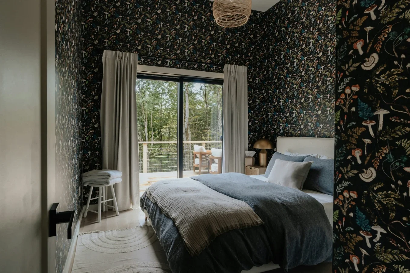
Designers do the opposite. Rather than adding more of the same, they give the room a single place to look. Wallpaper is the ideal tool for this because it adds three things at once, pattern, subtle colour, and depth, on one surface, without disturbing the rest of the scheme. Every calming neutral you already own stays exactly where it is. One wall simply becomes the reason the room holds together, the anchor the whole space was missing.
The overcorrection trap
The second mistake is overcorrecting. Having realised the room needs something, people reach for something loud to compensate, and they shatter the calm they wanted in the first place. The more skilful move is a pattern that adds personality gently. This is where nature-led and botanical designs earn their place, because their colours, soft greens, warm sand, muted earth tones, are close cousins of the neutrals already in the room. The pattern feels like it belongs rather than like it was imposed, so the room gains character without losing its ease. It reads as an extension of the calm, not a departure from it.
Tone it to what you already own
Getting the tone right is what separates a designer result from a mismatched one. Choose a pattern whose colours already live in the space, in the cushions, the timber, the flooring, so the papered wall looks as though it grew out of the scheme. The same botanical in the wrong greens will fight a warm neutral room; in the right tones it completes it. Hold samples against what you already own before you decide, and let the room tell you which version belongs. The right choice rarely announces itself loudly; it simply looks, on the wall, like it was always meant to be there.
Let the rest of the room stay quiet
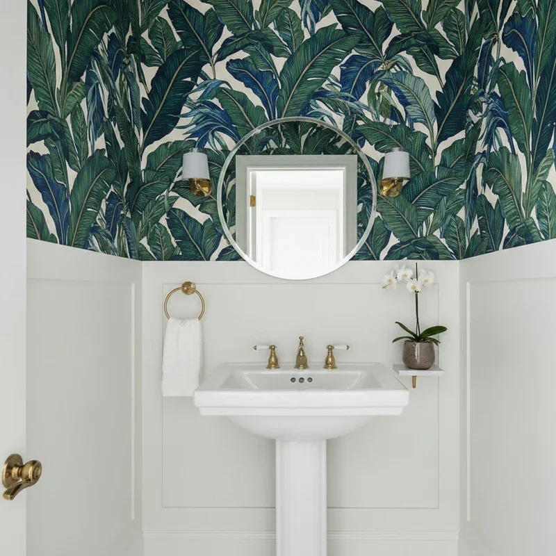
As with any feature wall, the calm around it is what makes it work. Let the papered wall be the single moment of pattern, and keep the surrounding walls and the larger furniture in the neutral palette. The contrast between the quiet room and the one characterful wall is exactly what gives a neutral scheme its personality without tipping it into busy. Restraint is not the opposite of this idea; it is the mechanism that makes it succeed. Think of the neutral palette as the frame and the papered wall as the picture. A frame that competes with the picture ruins both, but a quiet frame lets a single image carry the whole room, and that is the relationship a neutral scheme and one patterned wall are meant to have.
A few quick questions
How do I add personality to a neutral room without losing the calm? Add one patterned feature wall in tones close to your existing palette. It gives the room a focal point and character while everything else stays neutral and restful.
What kind of wallpaper suits a neutral interior best? Soft, nature-led patterns such as botanicals, because their colours sit close to neutral tones, so they add life and movement without overpowering the scheme.
Does the pattern need to match my existing colours? Yes. Pick a pattern whose colours already appear somewhere in the room, so the wall looks intentional and integrated rather than bolted on.
The one shift that fixes it
The whole idea comes down to one shift in thinking. A neutral room does not need more neutral; it needs one place for the eye to land. A single well-chosen patterned wall, toned to the palette and softly nature-led, gives a calm scheme the personality it was missing without sacrificing any of its ease. Before you commit, hold a sample against your existing colours and view it under the room’s evening light, because that is when a soft pattern settles into a neutral space and shows you, honestly, whether it belongs.
Stay up to date with our latest ideas!