Smart Color Strategies to Highlight Features in Your Living Space
Learn smart color strategies to highlight key features in your living space, enhance depth, guide the eye, and create a balanced, cohesive interior.

Have you ever noticed how a space can affect your mood? You don't register it consciously, but something about certain spaces can make you feel calmer or more tense, heavier or lighter...Usually, this has to do with colors. Yes, furniture and décor play a role, too, but colors? They literally influence our mood and attention. Even behavior and decision-making (which is why you'll see certain colors over and over again in branding and marketing).
This is why the choice of paint color matters so much. The right one will not only make you feel how you prefer to feel in a particular room, but also guide the eye and correct proportions. And when you use color with intent, you can highlight architectural features you already have instead of trying to compensate with more stuff.
Use Color to Work With the Architecture
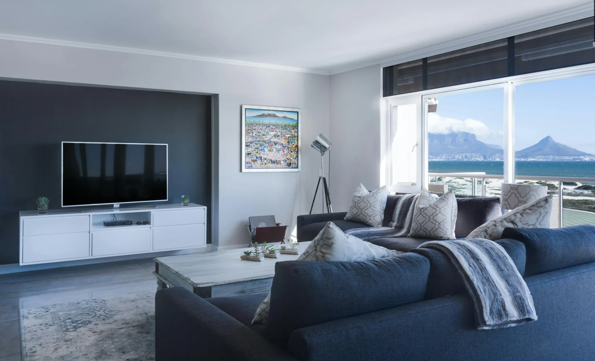
Rooms have hierarchies: ceiling height, window placement, alcoves, columns, beams... These details guide the eye. Where color can help here is in making those features clearer rather than competing with them.
Dark shades pull surfaces inward. Light ones push them out. That single fact lets you correct or emphasize proportions without moving a wall. So, for example, if you have a long, narrow living room, you can use slightly darker tones on the shorter end walls to visually compress the space. If you have low ceilings, you can make them look taller with light walls and slightly brighter trim or ceiling.
And yes, trim matters. Designers often treat it as an afterthought, but trim color controls where walls “stop.” High-contrast trim sharpens edges and suits rooms with strong architectural lines, while low-contrast trim softens transitions and works better in open-plan spaces where you want visual flow instead of punctuation.
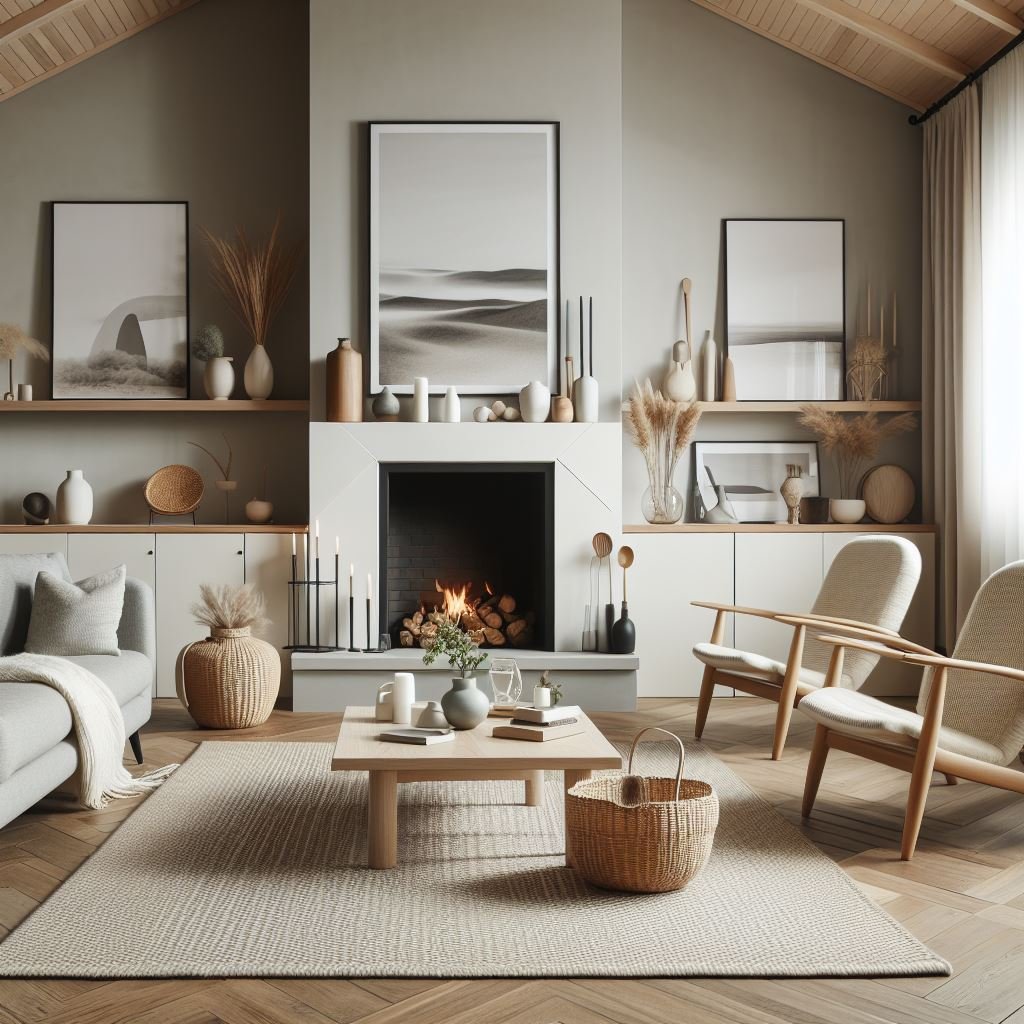
Choosing a Focal Wall Without Guesswork
A focal wall succeeds when it feels inevitable, not forced, usually sitting behind a primary anchor like a sofa or fireplace. However, achieving this requires more than just furniture placement; wall size and lighting are equally critical.
Large surfaces handle saturated tones well, while north-facing rooms can mute colors unexpectedly. This is why painting an accent wall is most effective when the color responds directly to these environmental factors and the room’s unique structure.
By balancing purpose with restraint—a principle Sundeleaf consistently highlights in its interior paint guidance—the result is a feature that feels practical and considered rather than just decorative.
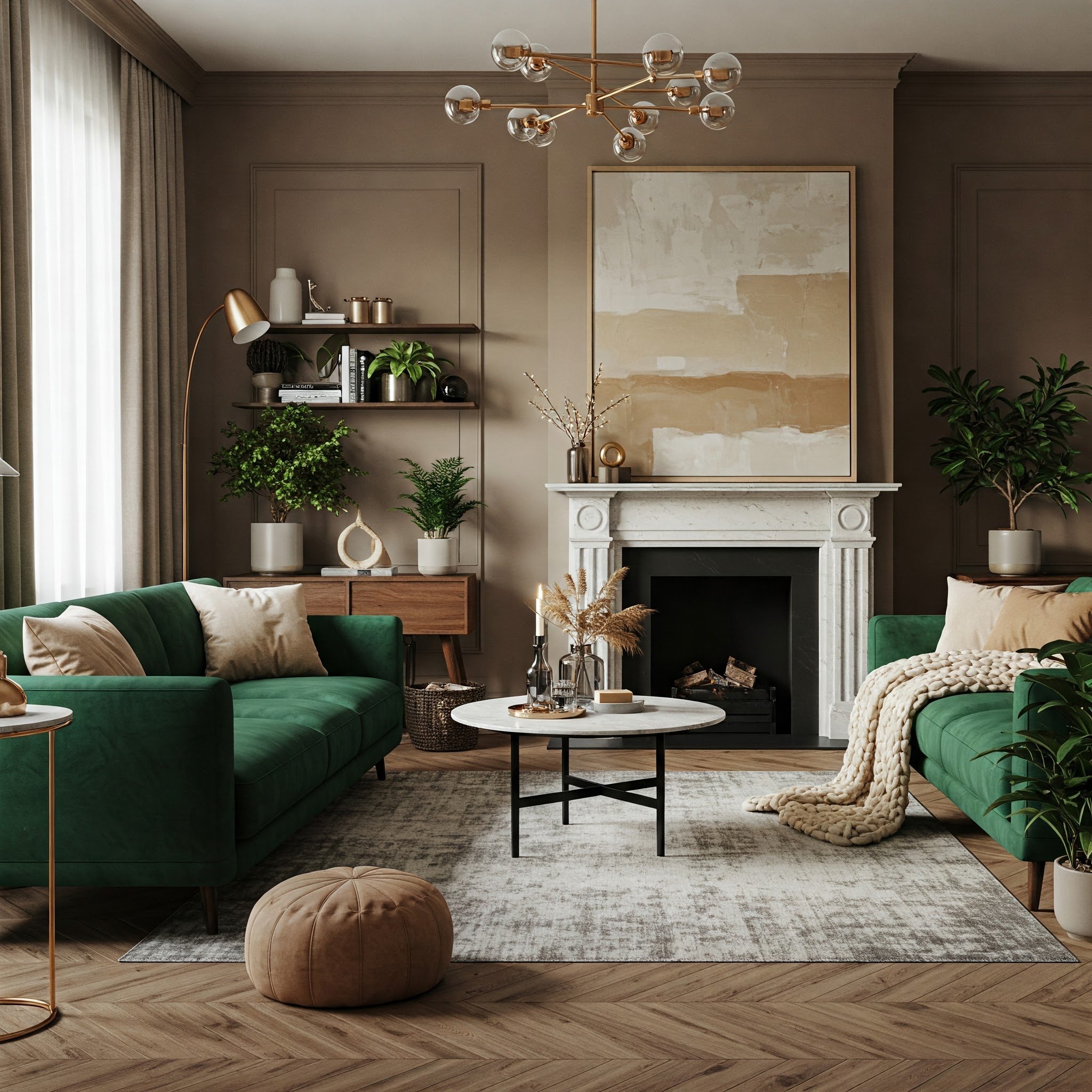
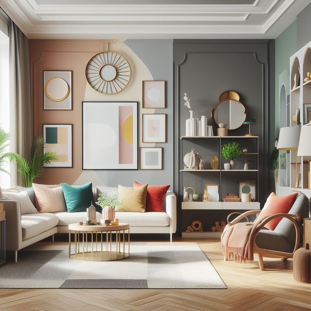
Color Relationships Matter More Than Individual Shades
You don’t experience wall color in isolation. Furniture, flooring, and textiles all vote. And they vote loudly.
Start with undertones. A gray sofa with blue undertones can clash subtly with walls that lean green or beige, even if the colors look “neutral” on paper. That tension often explains why a room feels off without any obvious mistake.
Contrast deserves equal attention. High contrast creates clarity and structure. Low contrast creates calm and cohesion. Neither is better by default. But a living space designed for entertaining often benefits from sharper contrast to energize the room. And a space meant for unwinding works better when colors sit closer together on the value scale.
And repetition matters, too. When a wall color reappears in a cushion, artwork, or rug detail, the room reads as intentional. Without repetition, even good colors feel accidental.
Accent Colors Should Support, Not Compete
As for accent colors, they work best when they show up sparingly and with purpose. One or two strong accents outperform a scattered palette (unless your style is very whimsical, of course). Use them to guide movement through the space: near entry points, around seating areas, or along architectural breaks.
In short, fewer colors, better decisions.
By the way, metal finishes, wood tones, and even plants count as color accents. Treat them as part of the system, not background elements.
Stay up to date with our latest ideas!