Preppy Entryway Decor: Monograms, Stripes, House Numbers
Give your entryway a preppy makeover with monograms, stripes, and bold house numbers that add charm, personality, and timeless curb appeal.

Preppy style starts at the door. Before anyone sees your living room, they notice the approach: the mat underfoot, the hardware, the numbers, the small but telling details. Get those right and the whole house reads as polished—even if the rest of the place is still a weekend project. This guide walks through a tidy, preppy formula built on three cues: a monogram, a stripe, and a crisp set of house numbers. Nothing fussy; just clean lines, good contrast, and materials that wear well.
What Makes an Entry Feel “Preppy” (and Not Stiff)
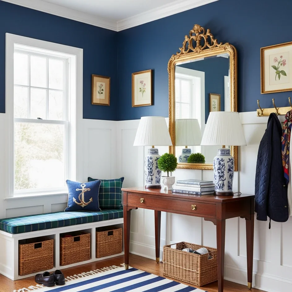
Preppy decor is orderly but not severe. Start with navy and white, let a bit of brass in the hardware do the warming, then break the symmetry. A 2×3 striped mat—narrow bands, cream on navy—gives the threshold some snap without turning it into a costume. Simple banding gives you that fresh, collegiate energy without turning the stoop into a theme. It also plays nicely with the kinds of exteriors LordDecor readers gravitate toward—black-and-white facades, navy clapboard, and modern white trims. On a monochrome exterior, a narrow navy-and-cream stripe gives the entry a focal point so the door doesn’t disappear.
If your exterior is black and white, you’re halfway there—the look already has contrast, and preppy style thrives on that snap. For inspiration—and to sanity-check how your trim and hardware read in daylight—take a spin through black and white house exterior. You’ll see the difference a strong entry mark makes, even from the sidewalk.
Monograms that Read Crisp, Up Close and Far Away
Monograms carry the look, but only if they’re legible. Two things decide legibility more than any font choice: finish and contrast. Matte finishes don’t blind your visitors; gloss will, especially in afternoon sun. Use a plain backing, generous margins around the letters, and resist piling on borders or scrolls. A single initial centered on the mat or transom usually wins over a complex crest.
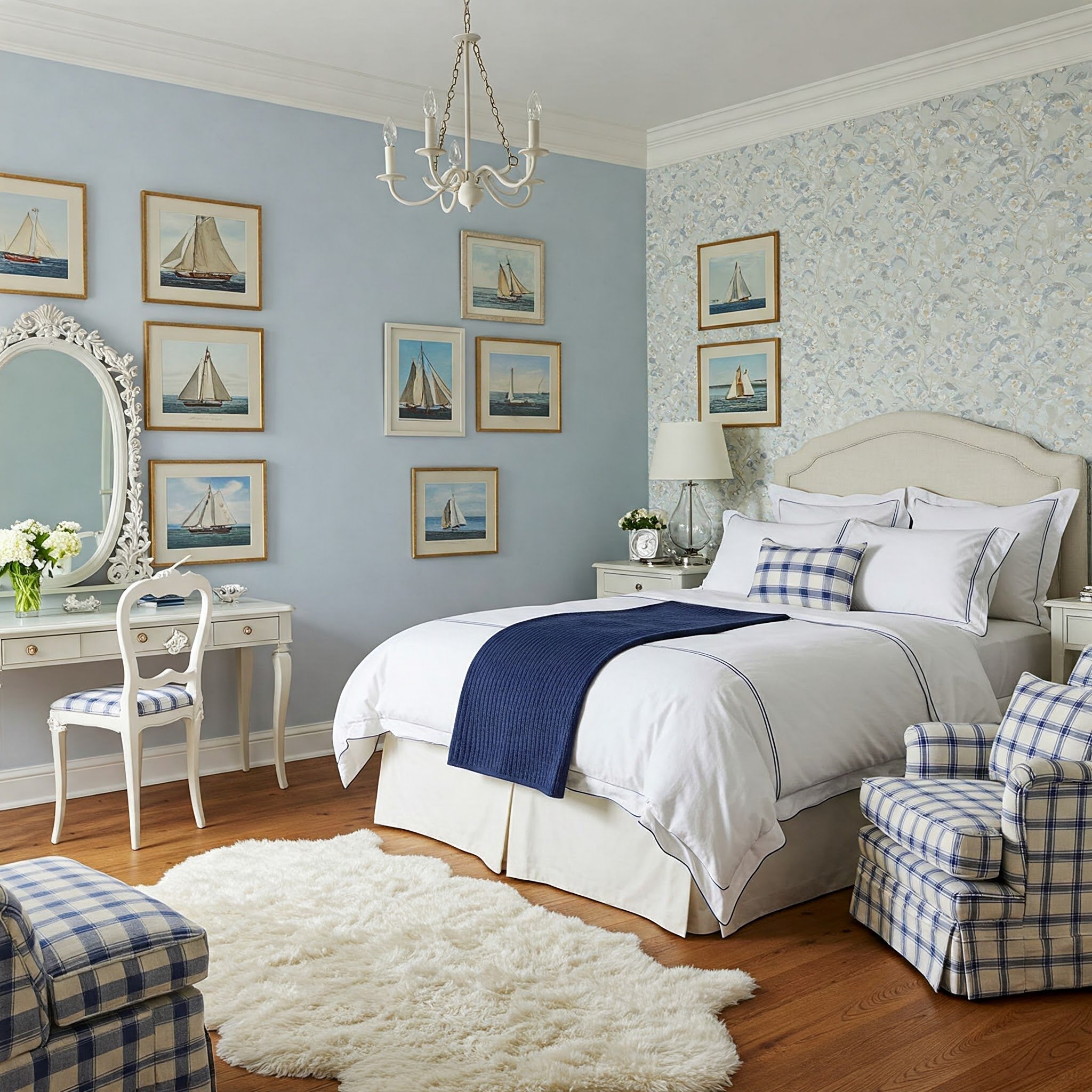
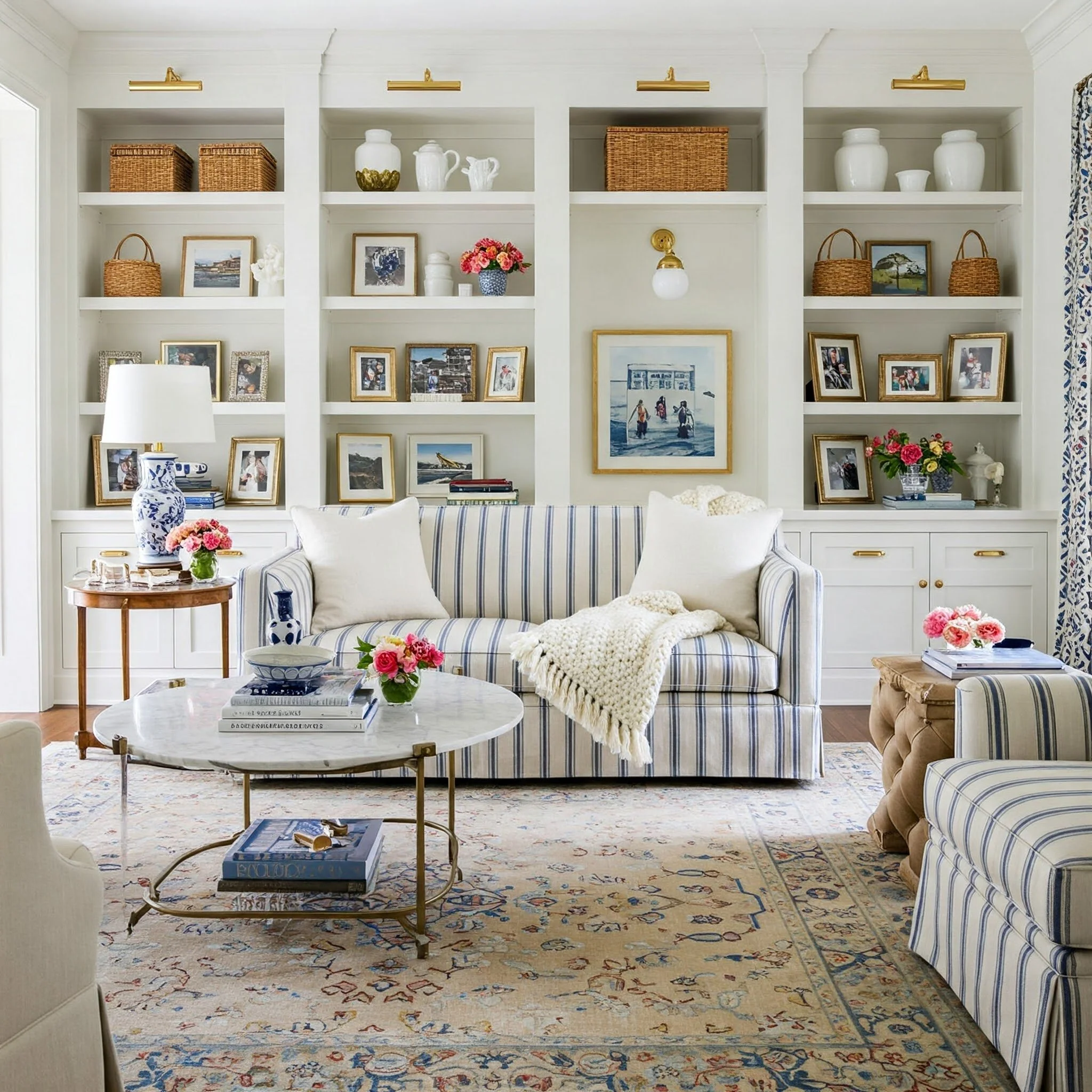
If your home already leans preppy—striped textiles, brass hardware, pale woods—work that into the foyer as well for a clean handoff. The ideas in preppy house and preppy living room show how to echo the same color family inside (navy, green, blush, or camel) so the threshold doesn’t feel like a style change.
Stripes at the Threshold: Where and How to Use Them
Stripes do three useful things outdoors. Use the mat to trap dust and to bracket the entry visually. If it’s striped, stay simple—navy with cream, black with white, or green with ivory—so it doesn’t fight the door color. Go narrow bands for a flat, modern door then bump the stripe width for traditional paneling.
Lighting matters more than people think. A simple wall lantern or two small sconces will pull the stripe forward at night and keep the entry from feeling flat. If your numbers are mounted nearby, aim for even illumination so the viewer’s eye can read the entire composition—door color, stripe, numbers—in one glance.
House Numbers: Scale, Placement, and Contrast
Numbers are where style meets function. If people can’t find your address in five seconds, the design has failed—no matter how pretty the font is. As a rule of thumb, a 4–6 inch character height is easy to read from the street on typical suburban setbacks; larger lots or busier roads justify a size bump. Contrast is non-negotiable: light numbers on a dark field or dark on light. That’s also friendlier for low-vision visitors, echoing basic color-contrast guidance used in accessibility standards.
Mount numbers where eyes land first—beside the door or on a plaque facing the main approach. Use a non-glare face and a quiet background. If you’re upgrading hardware, numbers, and the mailbox, order them together so finishes match and the facade reads as one piece.
For a clean, durable solution, custom architectural signage is a reliable route for address plaques and nameplates. Cast metal holds fine detail, stays readable after a few seasons of finger smudges and dust, and ages in a way that suits preppy brass and bronze tones.
Materials that Last Through Sun and Rain
Preppy only works if it stays crisp. In full sun, plastics chalk, thin paints fade, and cheap coatings go patchy. Metals with proper powder coat, solid brass with a protective lacquer, and hardwoods finished for exterior exposure are safer bets. If you live with harsh UV, favor satin and matte over high gloss—glare kills readability at the angles people actually view the door.
Little details help durability: concealed fasteners where possible, drainage gaps for plaques, and a small standoff so water and grit don’t sit trapped against the wall. Clean hardware once a season, rinse mats, and tighten the screws you never think about. The entry will look “always fresh” without new purchases.
A Quick Word on Visibility and Legibility
Good-looking is great; findable is better. Emergency responders and delivery drivers rely on house numbers that can be read at a glance. High contrast and clear letterforms are the two biggest wins, and they’re the same things accessibility advocates recommend for public signage. If you’re curious about the logic behind color contrast and non-glare surfaces in wayfinding, the U.S. Access Board’s primer on sign legibility is a straightforward explainer—useful even though it’s aimed at public buildings.
Mail carriers are practical: clear, consistent numbers by the door cut down on misdelivered mail. The USPS Postal Addressing Standards (Publication 28) spells out where the address should sit and how it should read so it’s easy to spot—and scan.
Pulling it Together: a Preppy Entry in Three Moves
Start with the numbers. Pick a size you can read from the curb, give it real contrast, and mount it where the eye naturally lands. Then sort the monogram—one initial, clean font, matte face. Finish with the stripe. A simple banded rug or painted riser pattern frames the door without shouting.
If your exterior is already black and white, you’re practically there; a brass knocker, dark stripe, and tidy plaque will look intentional within minutes. If you’re working with navy siding, bring in warm woods or brass so the palette doesn’t feel chilly. And if your home is crisp and white, don’t be afraid of a strong letterform—the contrast is your friend.
Conclusion: Preppy Entryway Decor that Holds Up
Preppy entryway decor isn’t a pile of accents; it’s a few smart choices done well. A legible monogram, a neat stripe, and numbers with proper contrast will carry the look—and they’ll keep looking sharp after a summer’s worth of sun and foot traffic. If you prefer a single, polished statement piece, cast plaques from custom architectural signage pair naturally with brass hardware and striped textiles. For more ideas on dialing in the rest of the palette, browse LordDecor’s takes on black-and-white exteriors and bring that language inside with preppy house and preppy living room—the goal is a front door that feels welcoming, buttoned-up, and unmistakably yours.
Stay up to date with our latest ideas!