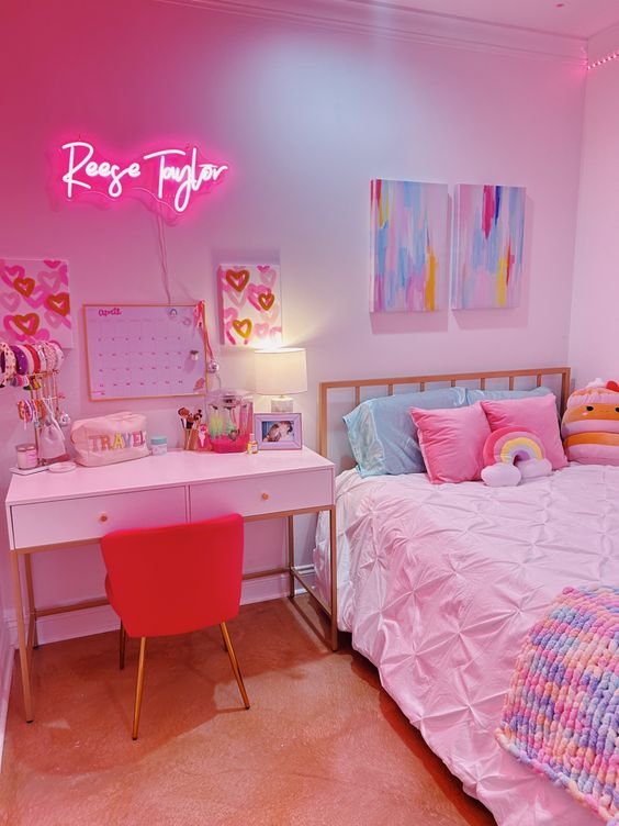
15 Pastel Room Ideas for a Soft and Dreamy Aesthetic
Create a dreamy sanctuary with 15 pastel room ideas. From lavender walls to mint accents, transform your space into a soft paradise.
Imagine walking into a room that feels like stepping inside a cotton candy cloud, where every surface whispers tranquility and every corner radiates gentle warmth. That's the magic of pastel aesthetics! These soft, muted hues aren't just colors; they're mood enhancers that transform ordinary spaces into dreamy sanctuaries where stress melts away like ice cream on a summer day. Whether you're drawn to baby pink's romantic charm, mint green's refreshing energy, or lavender's calming embrace, pastels offer a sophisticated palette that proves soft doesn't mean boring. Gone are the days when pastels were reserved for nurseries and Easter decorations. Today's pastel rooms blend vintage charm with modern sophistication, creating spaces that feel both timeless and totally Instagram-worthy. From subtle accent walls to full-on pastel paradise makeovers, these gentle giants of the color world can work their magic in any room, any style, and any budget. Ready to paint your world in the softest shades of happiness?
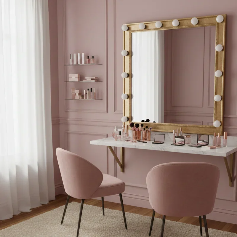
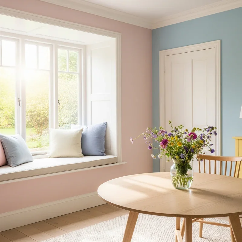
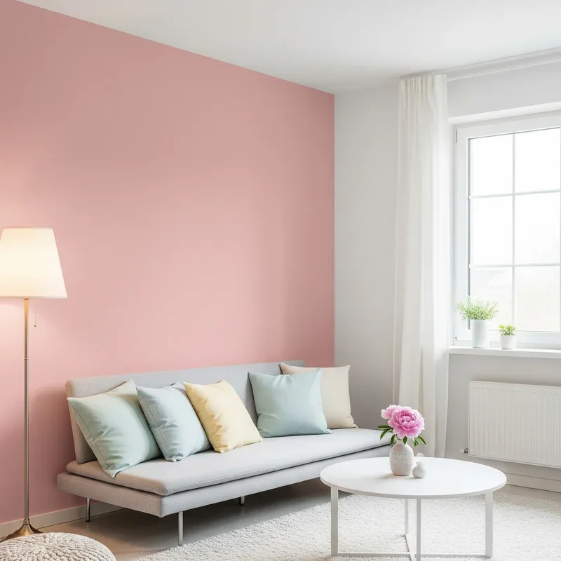
1. Blush Pink Accent Walls
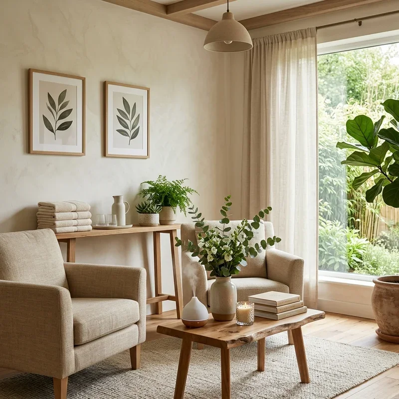
Transform your space into a rosy paradise with a blush pink accent wall that adds warmth without overwhelming your senses! This isn't your grandmother's Pepto-Bismol pink; modern blush tones range from barely-there nude pinks to dusty rose shades that sophisticate any room. The key lies in choosing the right wall: behind your bed for a romantic headboard effect, or opposite windows to catch and reflect natural light beautifully. Pair blush walls with white trim and gold accents for that coveted millennial aesthetic, or combine with deep greens for unexpected botanical elegance. The psychological impact of pink creates feelings of comfort and nurturing, making it perfect for bedrooms or reading nooks. Don't stop at paint; consider blush wallpaper with subtle textures or patterns that add depth without distraction. This single wall transformation costs less than a fancy dinner but delivers months of visual joy.
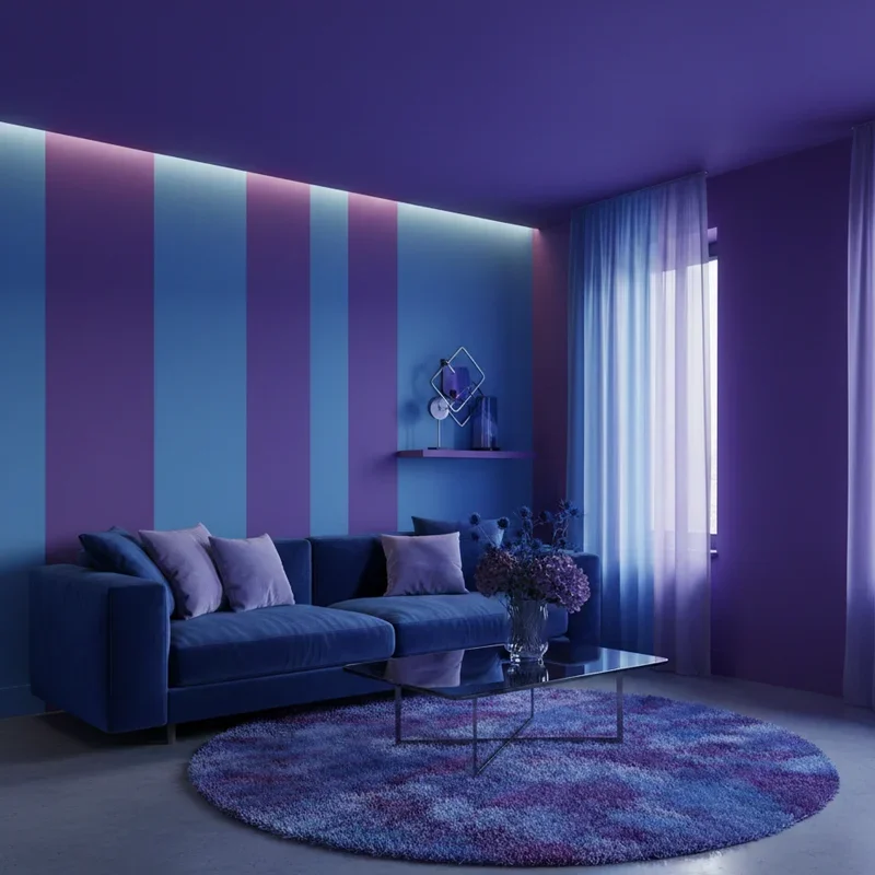
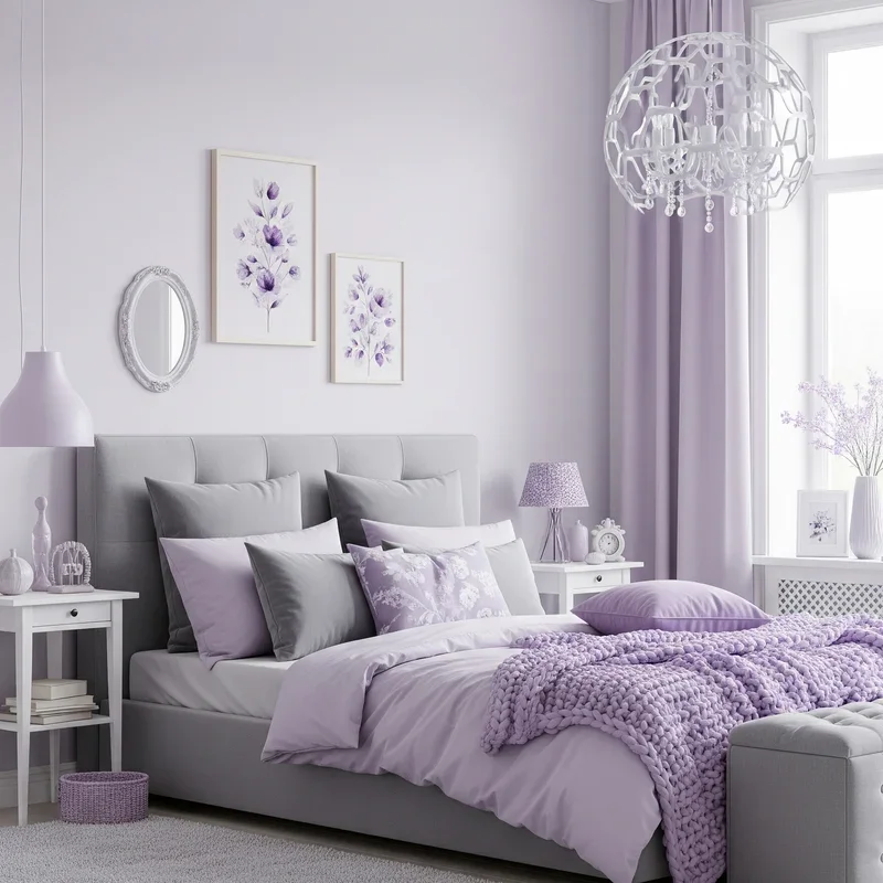
2. Lavender and Grey Combinations
Who says pastels can't be sophisticated? Lavender and grey create a color marriage that brings both serenity and style to any room! This pairing works because grey grounds lavender's whimsy while lavender softens grey's sometimes cold demeanor. Picture dove grey furniture against walls painted in the palest purple, or lavender bedding on a charcoal grey upholstered bed. The combination feels fresh yet timeless, working equally well in modern minimalist spaces or traditional settings. Add metallic silver accessories to enhance the cool undertones, or warm things up with rose gold touches. This palette particularly shines in bathrooms where lavender's spa-like qualities meet grey's practical elegance. Layer different shades of both colors through throws, pillows, and artwork for depth without chaos. The beauty lies in the balance; neither color dominates, creating a harmonious environment that promotes relaxation while maintaining visual interest.
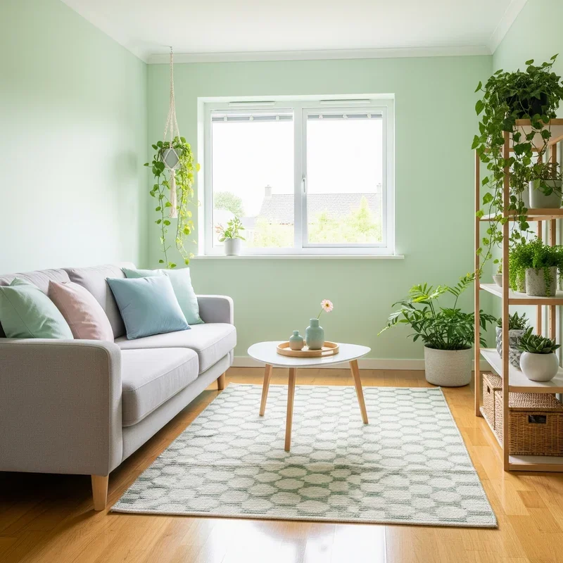
3. Mint Green Furniture Statements
Breathe fresh life into your room with mint green furniture that acts like a breath of fresh air in physical form! A mint green velvet sofa becomes the star of your living room, while a painted mint dresser transforms a bedroom from ordinary to extraordinary. This refreshing shade works with virtually every other pastel, making it the ultimate team player in your color scheme. The key to pulling off mint furniture lies in confidence; don't apologize for the color with timid accessories. Instead, embrace it with complementary pastels or create contrast with deeper jewel tones. Vintage pieces painted mint gain new life while maintaining their character, and modern furniture in this shade feels playful yet sophisticated. Consider mint dining chairs around a white table, or a mint accent chair that brightens a neutral corner. The color psychology of mint promotes clarity and emotional balance.
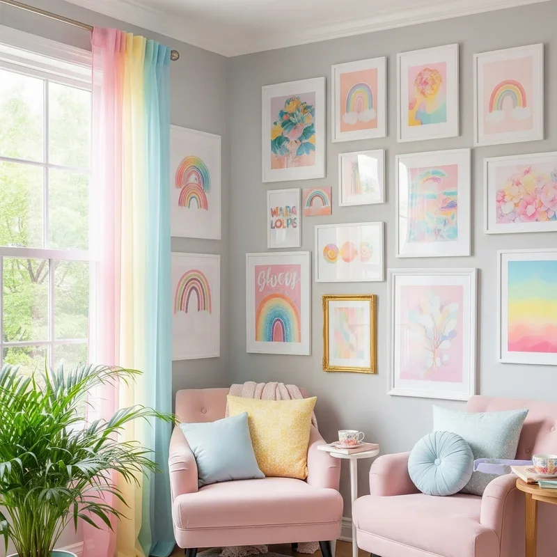
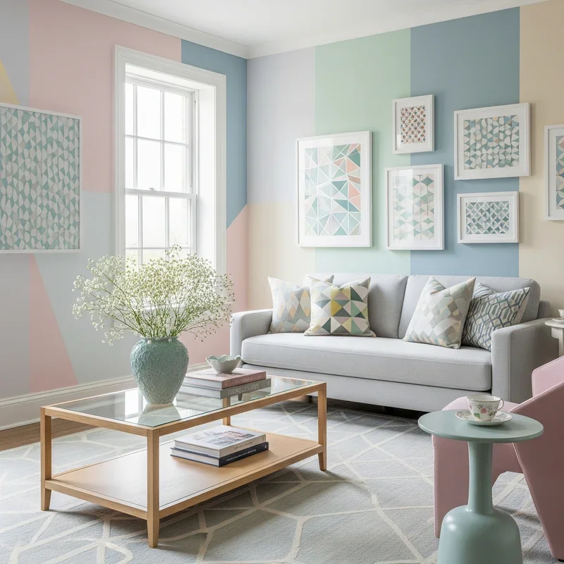
4. Rainbow Pastel Gallery Walls
Why choose one pastel when you can have them all in a stunning gallery wall that celebrates every shade of soft? Create visual harmony by selecting artwork, prints, and photos that each feature different pastel hues while maintaining similar intensities. Mix media fearlessly: watercolor paintings next to pastel photography, pressed flowers in soft-colored frames beside typography in mint and peach. The trick lies in maintaining balance; distribute colors evenly rather than clustering all pinks in one corner. Include white or cream pieces as visual breathing room between colors. Frame styles can vary from vintage gold to modern acrylic, united by the pastel theme. Start with larger anchor pieces and build around them, letting the arrangement grow organically. This approach transforms blank walls into conversation starters that showcase your personality while maintaining that dreamy aesthetic. Your rainbow gallery becomes a focal point that ties together all other pastel elements.
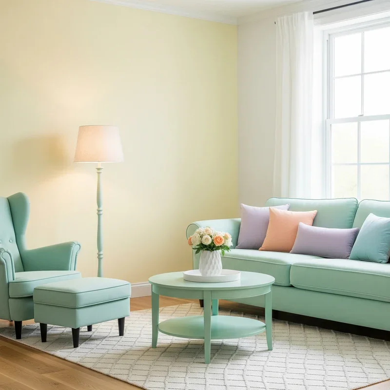
5. Soft Yellow Morning Corners
Create your own sunrise with soft yellow corners that make every morning feel like the first day of spring! This buttery, gentle yellow works magic in spaces where you want energy without intensity. Transform a reading nook with pale yellow walls and white built-ins, or paint just the window alcove to amplify natural light. Unlike bold yellows that can overwhelm, pastel yellow whispers rather than shouts, providing warmth that doesn't fatigue the eyes. Layer different yellow tones through cushions, throws, and artwork for dimension without monotony. This color particularly loves natural materials; pair with light wood, rattan, and linen for organic harmony. Plants thrive visually against soft yellow, their green leaves creating perfect complementary contrast. The psychological benefits include increased optimism and creativity, making these corners ideal for home offices or craft spaces where inspiration matters.
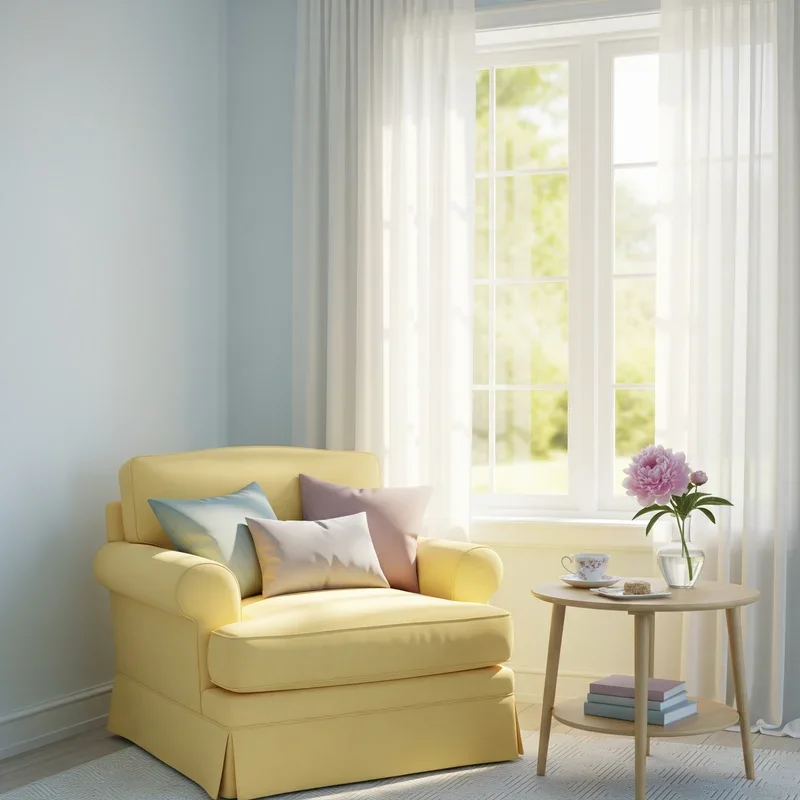
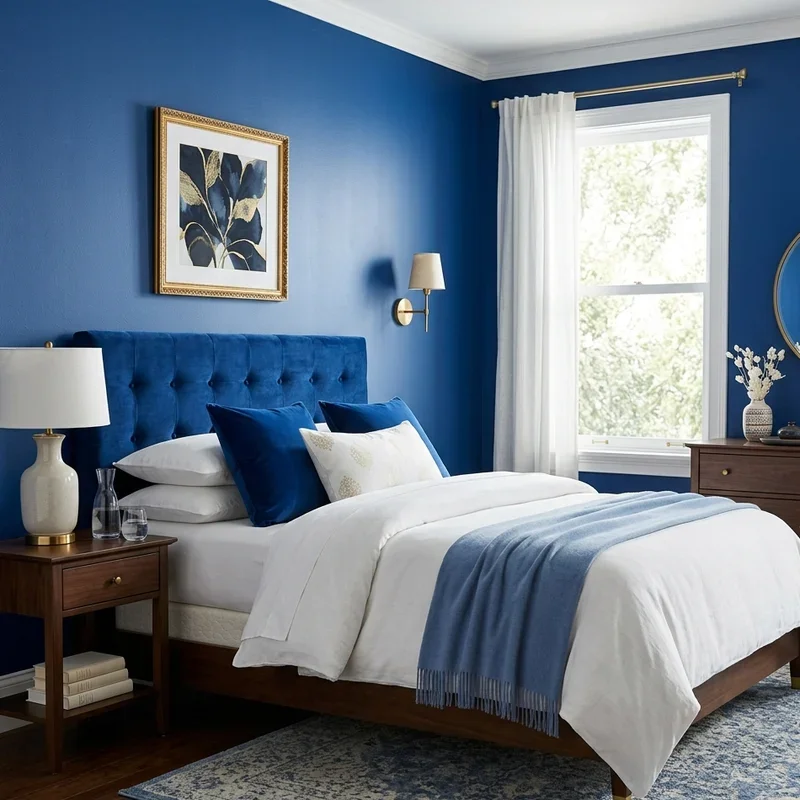
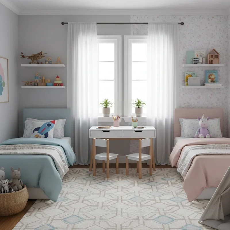
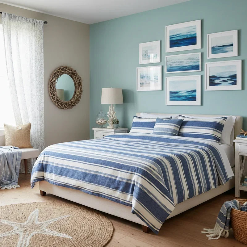
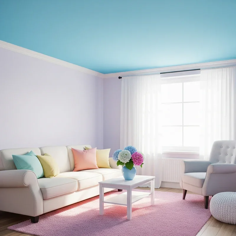
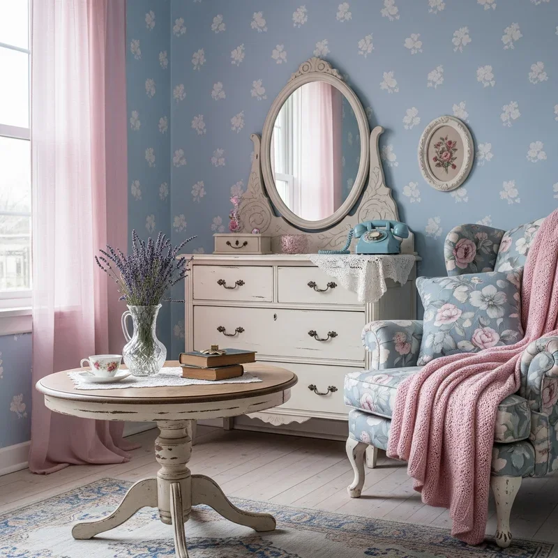
6. Baby Blue Ceiling Dreams
Look up and imagine clouds floating across a baby blue ceiling that transforms your room into an indoor sky! This unexpected pastel placement draws eyes upward, making rooms feel taller and more spacious while adding whimsy without overwhelming. The fifth wall deserves love too, and baby blue creates the illusion of openness that white ceilings can't match. This technique works beautifully in bedrooms where you'll actually spend time looking up, creating a calming vista for bedtime contemplation. Enhance the effect with cloud-like light fixtures or subtle star stickers for children's rooms. The color reflects light differently throughout the day, creating dynamic visual interest from dawn to dusk. Pair with white or cream walls to maintain airiness, or go bold with complementary pastel walls for full immersion. This simple change costs the same as painting any wall but delivers unexpected delight every time you enter.
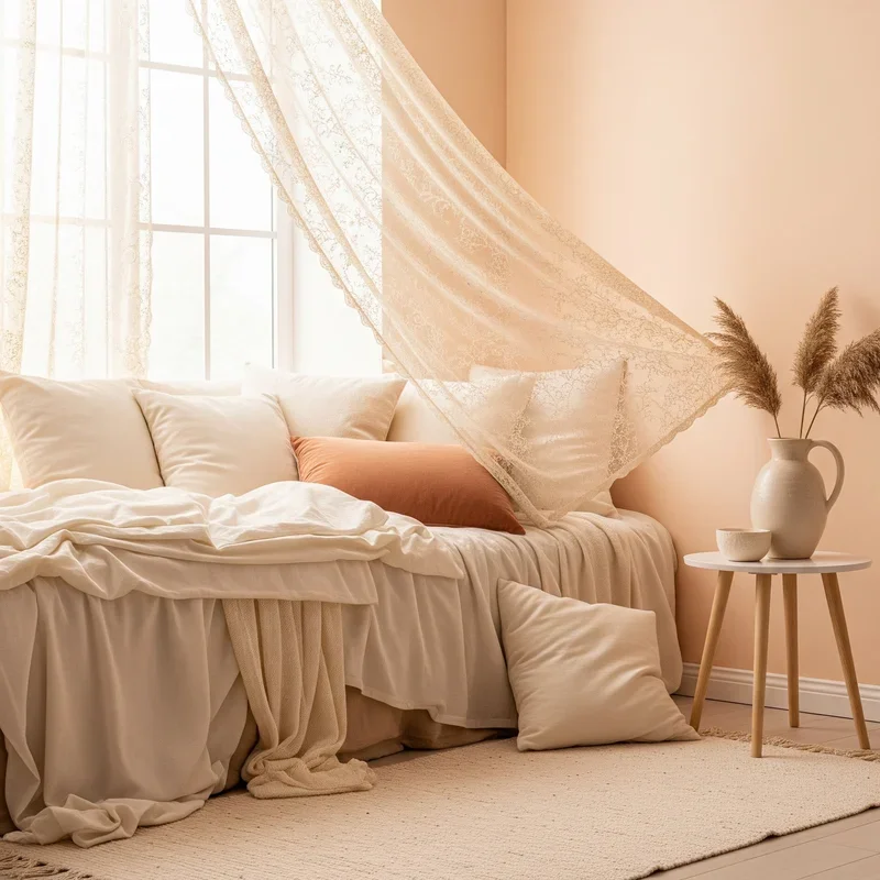
7. Peach and Cream Layering
Dive into the warmth of peach and cream combinations that create rooms feeling like permanent golden hour! These sister shades blend seamlessly, creating depth through subtle tonal variations rather than stark contrasts. Start with cream as your base through larger furniture pieces or wall color, then layer peach through textiles, artwork, and accessories. The warmth of peach adds life to cream's sometimes bland personality, while cream prevents peach from becoming too sweet. This pairing suits every style: add gold for glamour, wood for rustic charm, or black accents for modern sophistication. Textures become crucial here; combine smooth peach silk pillows with chunky cream knit throws for tactile interest. The psychological impact creates feelings of comfort and optimism, perfect for living spaces where you want guests to feel welcomed. This combination photographs beautifully in natural light, making your room eternally Instagram-ready.
8. Pastel Ombre Wall Techniques
Transform flat walls into artistic masterpieces with ombre techniques that blend pastels like watercolor paintings come to life! This gradient effect creates movement and depth, making rooms feel larger and more dynamic than solid colors ever could. Choose two or three related pastels, like pink fading to peach to cream, or blue transitioning through lavender to white. The technique requires patience but not professional skills; blend while wet using brushes, sponges, or even rags for different textures. Vertical ombres add height, horizontal ones create sunset effects, and diagonal gradients bring unexpected energy. This treatment works as accent walls or entire room transformations, depending on your courage level. The soft color transitions prevent harsh lines that can make spaces feel choppy. Your ombre wall becomes living art that changes appearance with shifting light throughout the day, ensuring your room never feels static or boring.
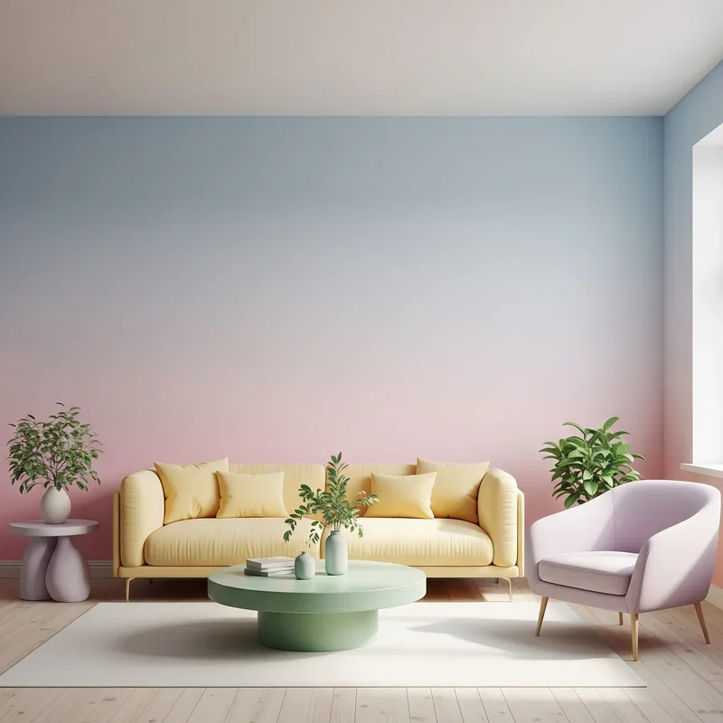
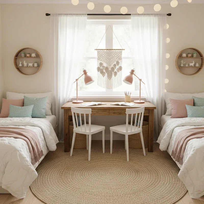
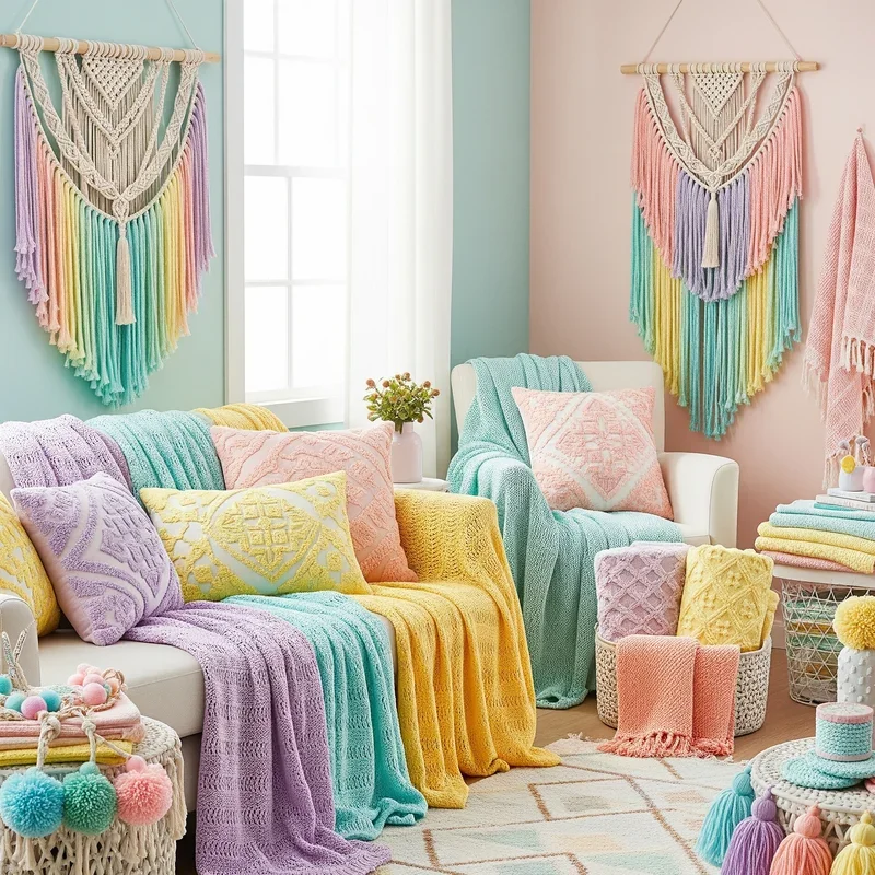
9. Mixed Pastel Textile Collections
Textiles offer the easiest entry into pastel paradise, allowing color experimentation without permanent commitment! Layer throws in mint, pillows in lavender, and rugs in blush for an instantly softened space that can change with seasons or moods. The key lies in varying textures: smooth cotton, nubby linen, plush velvet, and chunky knits all reflect light differently, creating visual richness despite the gentle color palette. Don't match everything; controlled chaos through mixed patterns in similar pastel tones creates that collected-over-time feeling. Bedding becomes your canvas: start with white sheets, add a dusty pink duvet, layer with sage green throws, and top with yellow accent pillows. Window treatments in sheer pastels filter light beautifully, casting colored shadows that enhance the dreamy atmosphere. This approach allows gradual room transformation, perfect for renters or commitment-phobes who want flexibility without sacrificing style.
10. Sage Green Natural Elements
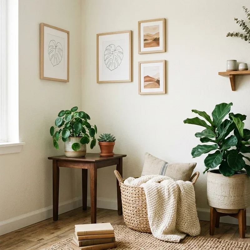
Bridge the gap between indoors and nature with sage green elements that bring organic tranquility to your pastel paradise! This earthier pastel grounds airier shades while maintaining the soft aesthetic you're after. Paint an accent wall sage and watch how it makes both plants and other pastels pop. Sage green furniture feels substantial without heaviness, especially in natural materials like linen-upholstered chairs or painted wood pieces. This versatile shade plays well with both warm pastels like peach and cool ones like lavender, making it the ultimate mixing medium. Incorporate actual sage and eucalyptus plants to enhance the botanical connection. The color promotes balance and growth psychologically, perfect for spaces where you need both relaxation and gentle energy. Layer different sage tones from grey-green to mint-adjacent for sophisticated depth that prevents monotony while maintaining cohesion.
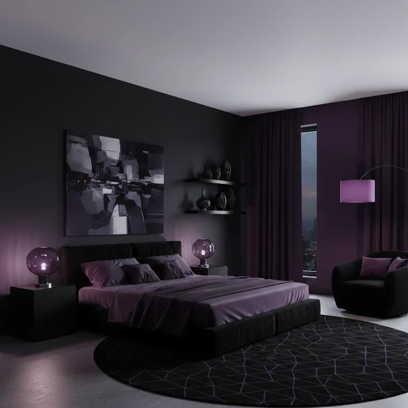
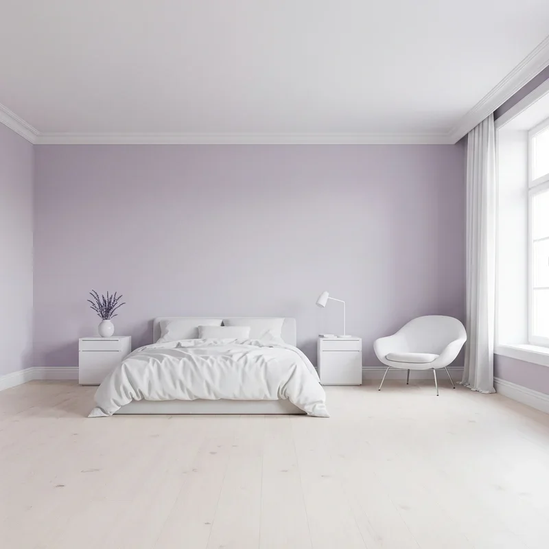
11. Lilac and White Minimalism
Prove that minimalism doesn't mean colorless with a lilac and white palette that whispers elegance! This combination offers just enough color to feel special while maintaining minimalism's clean, uncluttered essence. Keep furniture lines simple and let lilac appear in carefully chosen moments: a single accent wall, perfectly placed throw pillows, or one stunning piece of artwork. White amplifies lilac's gentle nature while preventing it from feeling too precious or juvenile. This palette loves natural light, which shifts lilac from cool morning tones to warm afternoon hues. Storage becomes crucial; clutter destroys the delicate balance these colors create. Choose quality over quantity in every element, from bedding to decorative objects. The psychological impact promotes mental clarity while maintaining emotional softness, perfect for bedrooms or meditation spaces. This approach proves that less truly becomes more when every element is intentionally chosen.
12. Powder Blue Vintage Touches
Transport your room to a gentler era with powder blue vintage elements that blend nostalgia with contemporary comfort! This classic pastel shade adorns vintage furniture beautifully, whether original mid-century pieces or flea market finds given new life. A powder blue vintage vanity becomes a bedroom focal point, while retro kitchen chairs in this shade brighten dining spaces. Mix authentic vintage with modern reproductions for budget-friendly authenticity. The color's timeless quality means it works with various vintage eras: Victorian, Art Deco, or 1950s atomic style. Pair with brass hardware and white accents for classic appeal, or add pink for sweetness. Vintage mirrors with powder blue frames reflect light while adding character. This shade photographs beautifully, giving rooms that sought-after vintage filter naturally. The nostalgic feeling powder blue evokes creates emotional comfort, making spaces feel like cherished memories.
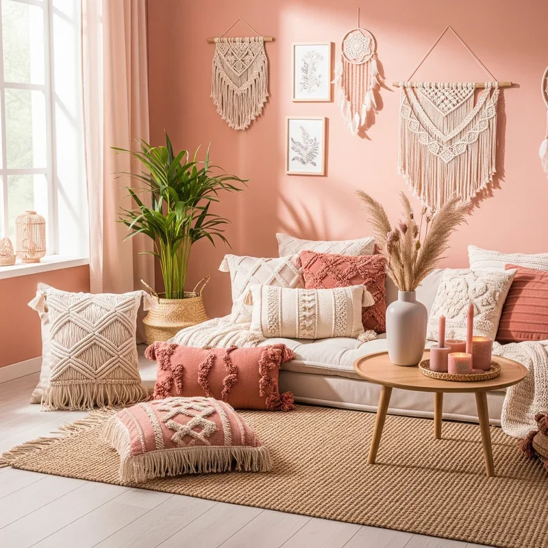
13. Coral Pink Boho Vibes
Inject energy into your pastel palette with coral pink elements that bring bohemian warmth without sacrificing softness! This livelier pastel bridges the gap between gentle and vibrant, perfect for those wanting more personality in their pastel rooms. Layer coral through Moroccan-style pillows, macrame wall hangings dyed in coral tones, or painted terracotta pots housing succulents. The color loves texture: think tassels, fringe, and woven elements that catch light and create shadows. Mix coral with other warm pastels like peach and yellow for sunset vibes, or contrast with mint for unexpected freshness. Global-inspired patterns in coral and cream create worldly sophistication while maintaining the dreamy aesthetic. This shade works particularly well in spaces with lots of natural materials like rattan, jute, and wood. The energy coral brings prevents pastel rooms from feeling too sleepy while maintaining that soft, approachable feeling.
14. Pastel Geometric Patterns
Add structure to softness with geometric patterns in pastel hues that prove gentle colors can make bold statements! Think triangles in rotating pastels, hexagons creating honeycomb effects, or chevron stripes in mint and pink. These patterns work through wallpaper, painted accent walls, or textiles like rugs and bedding. The key lies in scale: large patterns make bold statements while smaller ones create texture without overwhelming. Mix geometric elements with solid pastels to prevent visual chaos; let patterns be focal points while solids provide rest. Modern geometric designs in pastels bridge contemporary and soft aesthetics perfectly. Use painter's tape to create DIY geometric walls, choosing three to four pastels for cohesion. The angular nature of geometric patterns adds energy that prevents pastel rooms from feeling too relaxed or feminine. This approach particularly suits those wanting pastel rooms that feel fresh and modern.
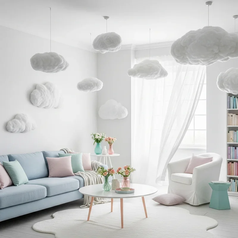
15. Cloud-Inspired All-White with Pastel Accents
Create the ultimate dreamy environment with cloud-white bases punctuated by floating pastel accents that appear like rainbow glimpses through clouds! Start with white everything: walls, major furniture, flooring if possible. Then add pastel elements strategically, like colorful drops in a white canvas. A single blush chair, mint lamp, or lavender artwork becomes more impactful against white backdrops. This approach offers maximum flexibility; swap pastel accents seasonally or when inspiration strikes. White reflects and amplifies pastels, making small color additions feel significant. Layer white textures to prevent sterility: white fur, linen, cotton, and wool create depth despite color absence. The psychological impact creates feelings of possibility and peace, like living inside a cloud. This technique particularly suits small spaces where too much color might overwhelm. Your room becomes a calm sanctuary where pastel moments provide gentle stimulation without disrupting serenity.
Conclusion
Creating a pastel room isn't about following rigid rules but about finding the soft shades that speak to your soul. These fifteen ideas prove that pastels can be sophisticated, energizing, or calming depending on your approach. Whether you dive into full pastel immersion or start with subtle accents, remember that the best rooms evolve gradually. Let your pastel paradise grow organically, adding colors that make you smile and removing ones that don't sing anymore.
Read next: Transform Your Space with Danish Pastel Room Ideas and Inspiration
Frequently Asked Questions
Q1: Will pastel rooms look childish or too feminine?
A: Not when balanced with sophisticated furniture, geometric patterns, and strategic color placement thoughtfully.
Q2: How do I prevent pastel rooms from looking washed out?
A: Add contrast through white, grey, or deeper accent colors and varied textures throughout.
Q3: Which pastel colors work best in small spaces?
A: Light pastels like blush, mint, and powder blue reflect light and expand space.
Q4: Can I mix warm and cool pastels together?
A: Yes! Mixing temperatures creates dynamic, interesting spaces when balanced properly throughout the room.
Q5: How often should I update pastel room decor?
A: Refresh accessories seasonally while keeping main elements constant for budget-friendly updates regularly.
Stay up to date with our latest ideas!