How to Boost Curb Appeal with Color and Texture Combinations
Boost your home's curb appeal with smart color and texture combos that add charm, character, and a welcoming touch to your exterior design.

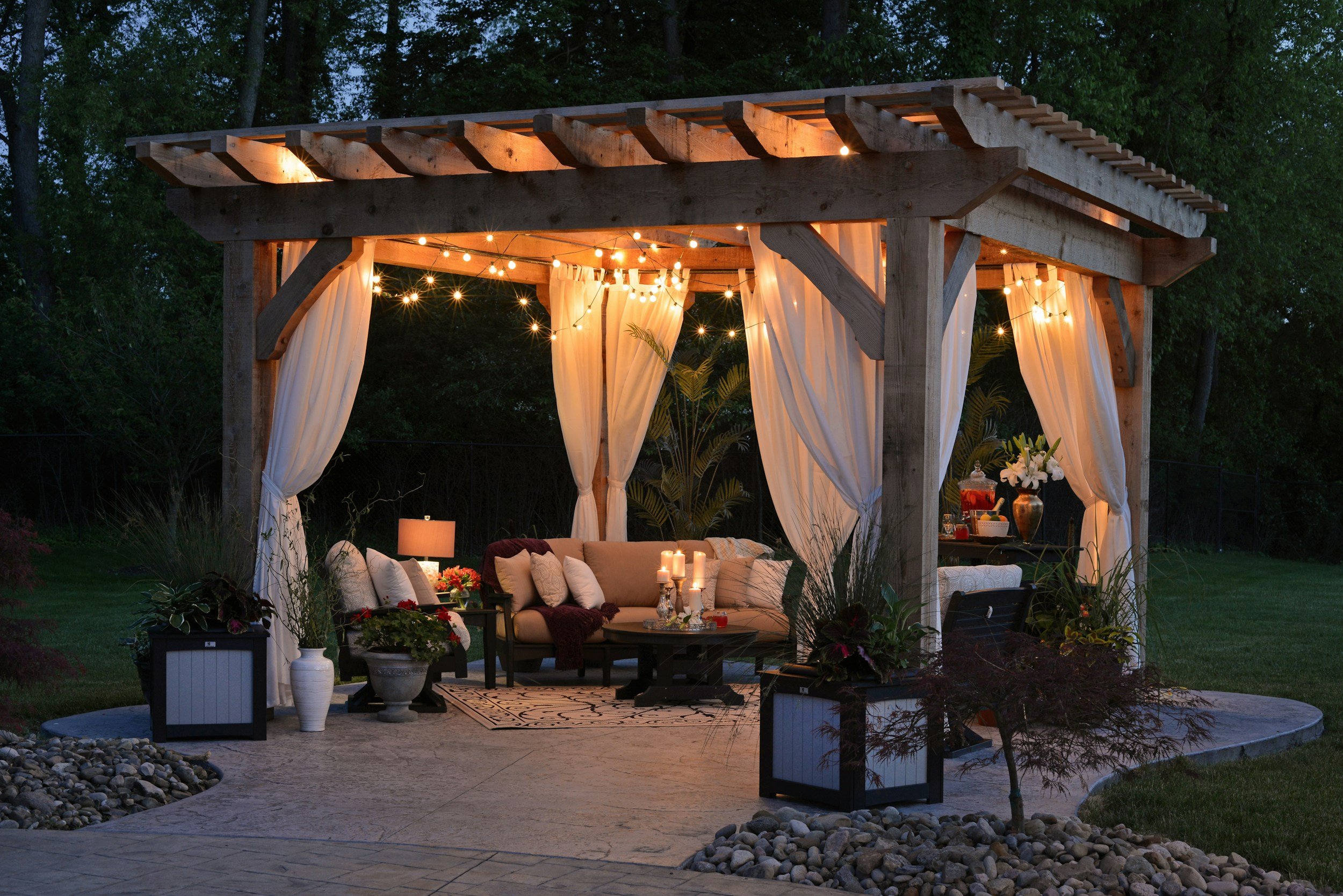
There’s a moment when you approach a house, even before stepping inside, and something just clicks. The colors complement each other without screaming for attention. The materials feel intentional, layered, and warm. It’s curb appeal done right—and more often than not, it comes down to the careful pairing of color and texture.
Curb appeal isn't just about first impressions. It’s about harmony. A home that visually flows from roof to landscaping communicates care, value, and style. Whether you're planning a renovation, prepping for resale, or just tired of driving up to a home that doesn’t feel finished, mastering the art of exterior coordination can completely transform how your property is perceived.
Why Color and Texture Pairings Matter
Colors set the tone. Textures add depth. Together, they tell a cohesive story. When homeowners overlook this relationship, it’s like wearing a designer suit with gym shoes—not because they clash in concept, but because they weren’t meant to work together.
A rough stone façade with crisp white trim? That says timeless elegance. Warm-toned bricks with deep charcoal roofing? That’s classic with a contemporary edge. The key isn’t just what materials you choose—it’s how they interact in light, season, and style.
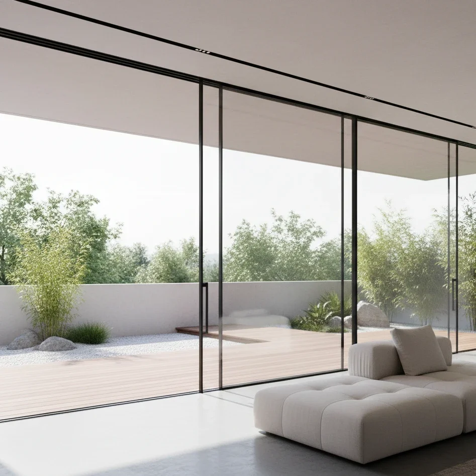
Texture, especially, often flies under the radar. It doesn’t just refer to touch—it’s how surfaces catch light, how shadow dances across them, how contrast creates visual interest. A wood-paneled garage door paired with a stucco exterior adds dimension. A smooth metal roof against rustic cedar siding creates balance.
The Building Blocks of Exterior Design
Let’s break down the key elements where color and texture come into play:
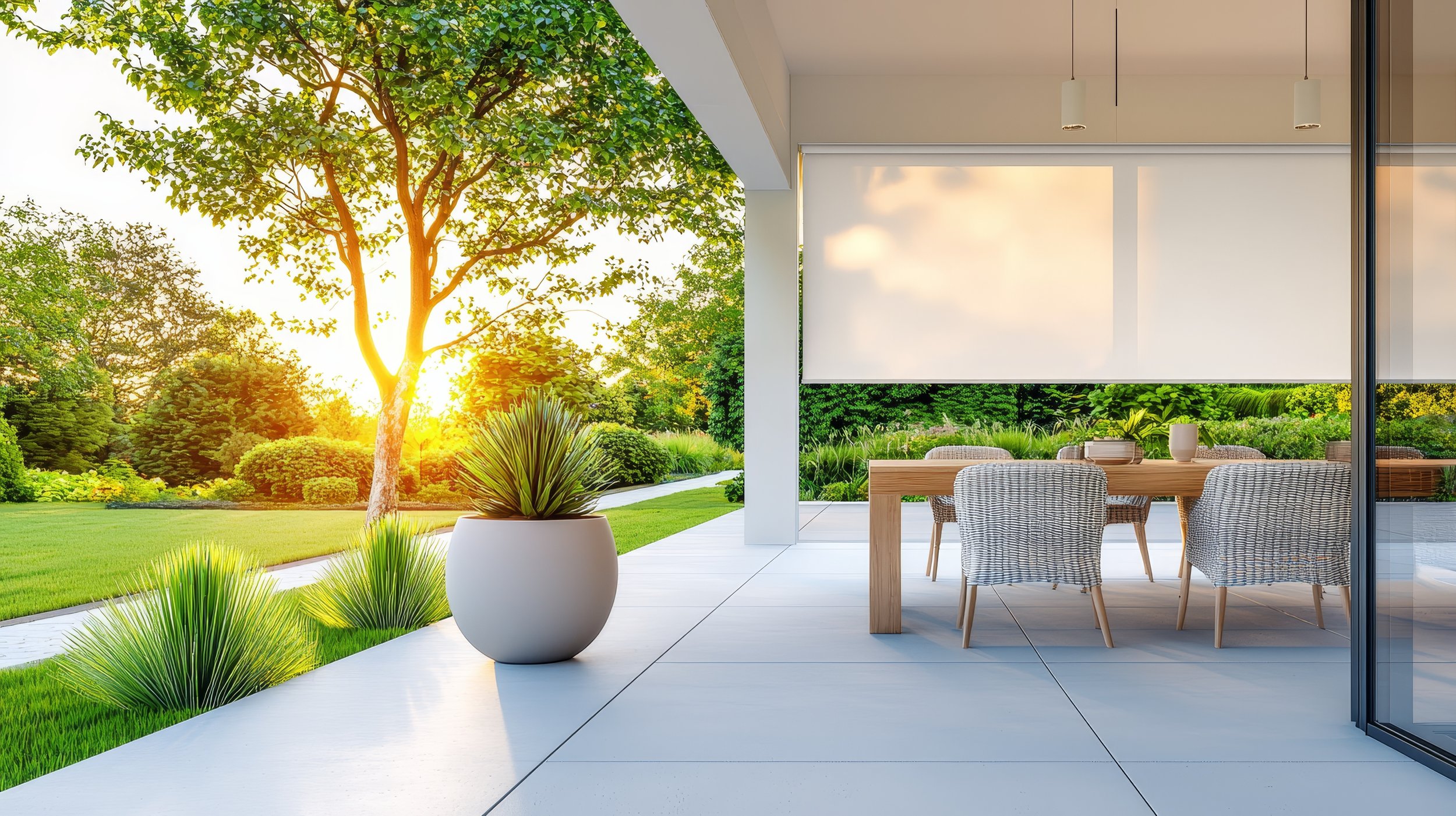
1. The Main Exterior (Walls, Siding, or Cladding)
This is your canvas. Whether you’re working with wood, vinyl, stone, or stucco, this element usually covers the most surface area—and sets the backdrop for every other choice.
Warm vs. cool tones: Warm colors (like beiges, browns, and terracottas) offer a welcoming feel. Cool tones (like grays, blues, and greens) evoke calm and sophistication.
Texture tip: Matte finishes absorb light and feel earthy. Glossy or smooth finishes bounce light and feel crisp.
2. Trim and Architectural Details
These frame the story—literally. Window casings, fascia boards, corner trims, and decorative molding might not be the star, but they’re what give structure and style to the home’s silhouette.
Contrast works wonders: A soft exterior palette paired with high-contrast white or black trim creates definition.
Subtle texture shift: Using the same color family but a different material (like wood trim against fiber cement siding) offers sophistication without stark contrast.
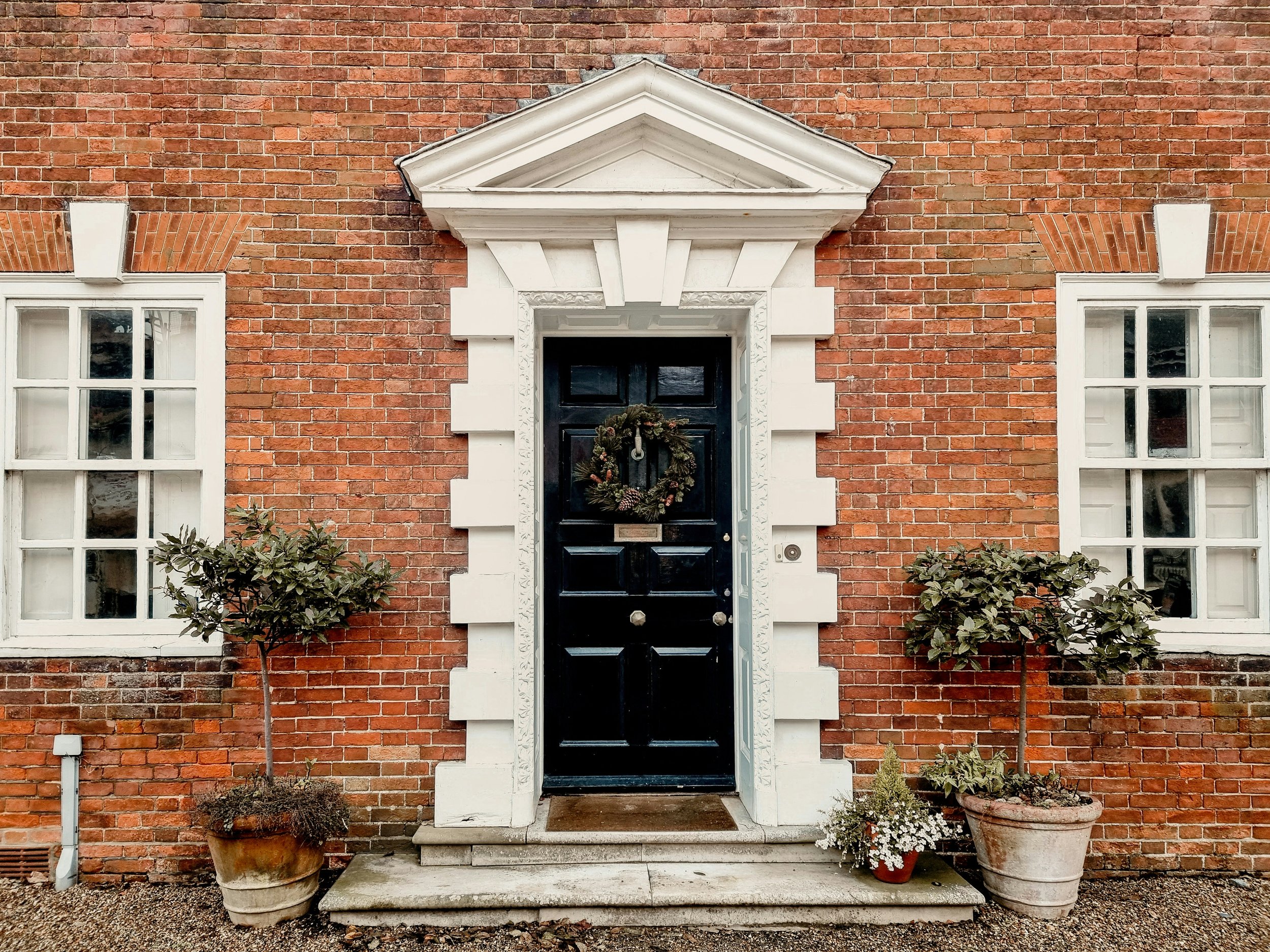
3. Doors and Shutters
This is your handshake. Your welcome mat. Bold colors work beautifully here, especially when balanced against more neutral exteriors.
Classic combos: Navy blue door on a white house. Deep red against sage green. Even mustard yellow on charcoal can turn heads—in a good way.
Texture detail: Think paneled wood doors, matte paint finishes, or wrought iron accents to break the visual monotony.
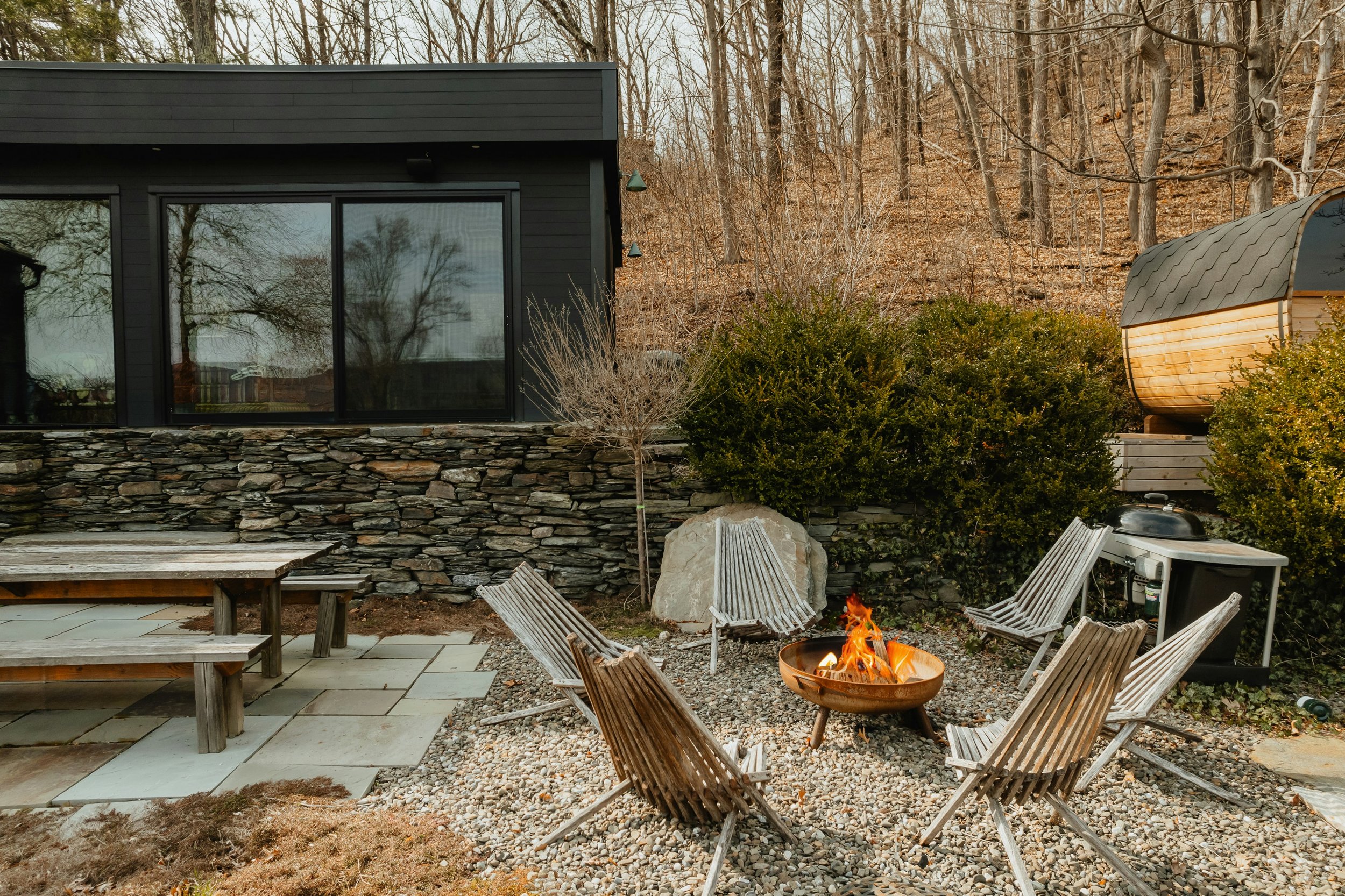
4. Roofing
Here’s where many homeowners either nail it—or completely miss the mark. The roof isn’t just a functional necessity; it’s a visual anchor that can either harmonize or clash with your exterior vision.
Updating your roofing—especially with high-contrast or modern tones like slate gray, matte black, or deep brown—can redefine the entire curb appeal. It’s not just about protection from the elements; a well-chosen roof creates visual weight at the top of your structure, grounding the home’s look and setting the stage for every other detail.
Slate tiles or architectural shingles bring texture and depth—much more dynamic than old, flat asphalt.
Standing seam metal roofs offer sleek lines that pair perfectly with modern or farmhouse-style homes.
And here’s the kicker: Updated roofs in current tones not only boost curb appeal—they can increase your property’s value by thousands, especially in competitive real estate markets. In some areas, room refreshments are pretty much necessary. In regions like Northern Virginia, where colonial and craftsman homes are common, homeowners often consult local professionals—many roofing companies in Northern Virginia specialize in blending modern materials with traditional styles to preserve character while improving curb appeal.
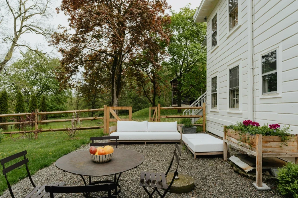
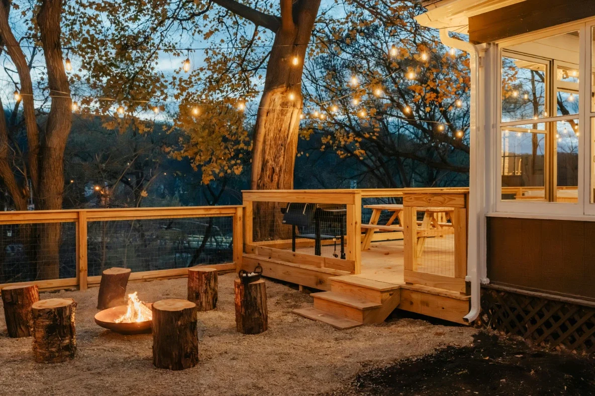
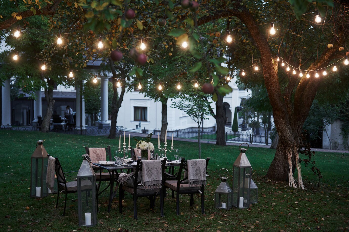
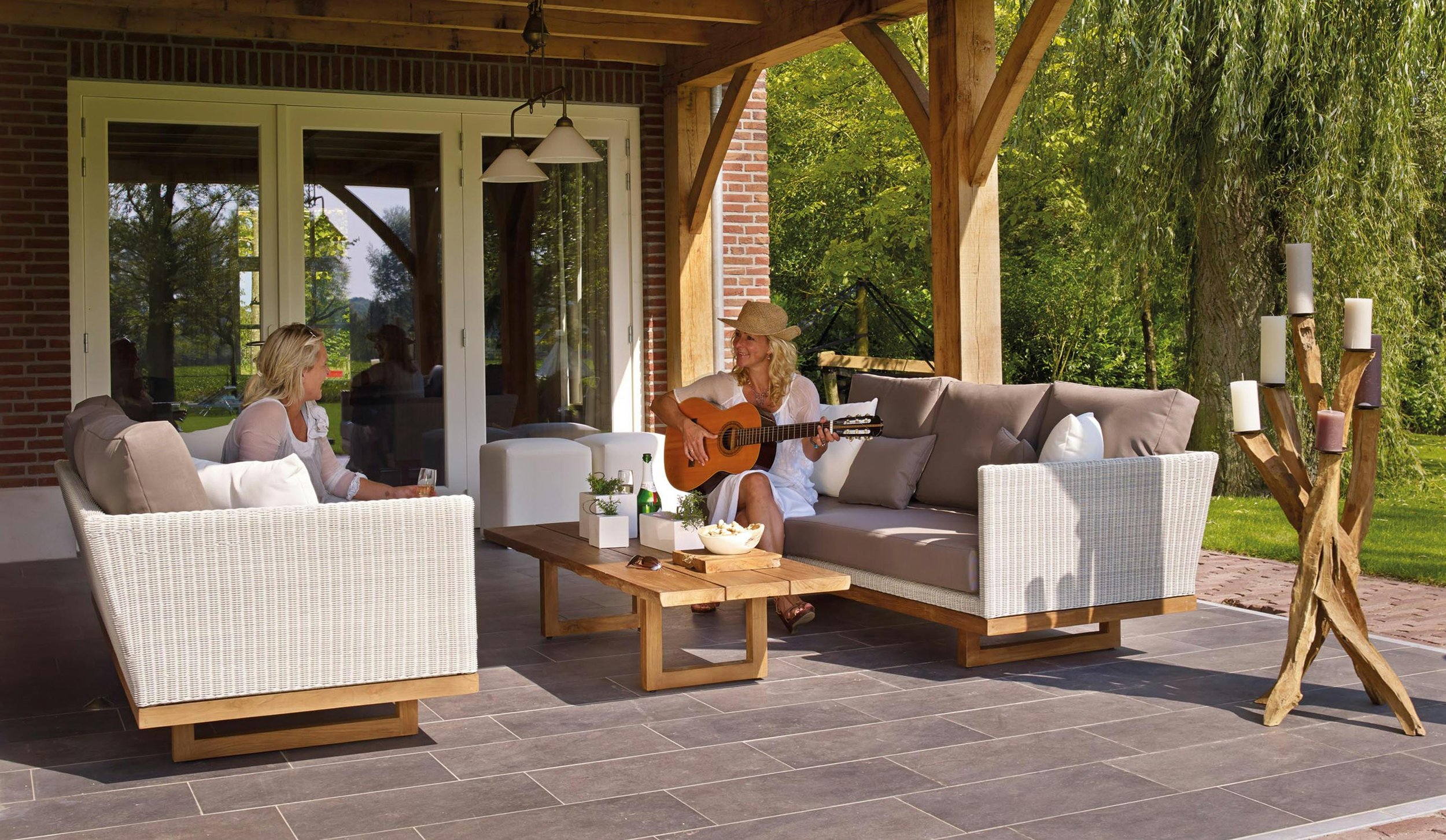
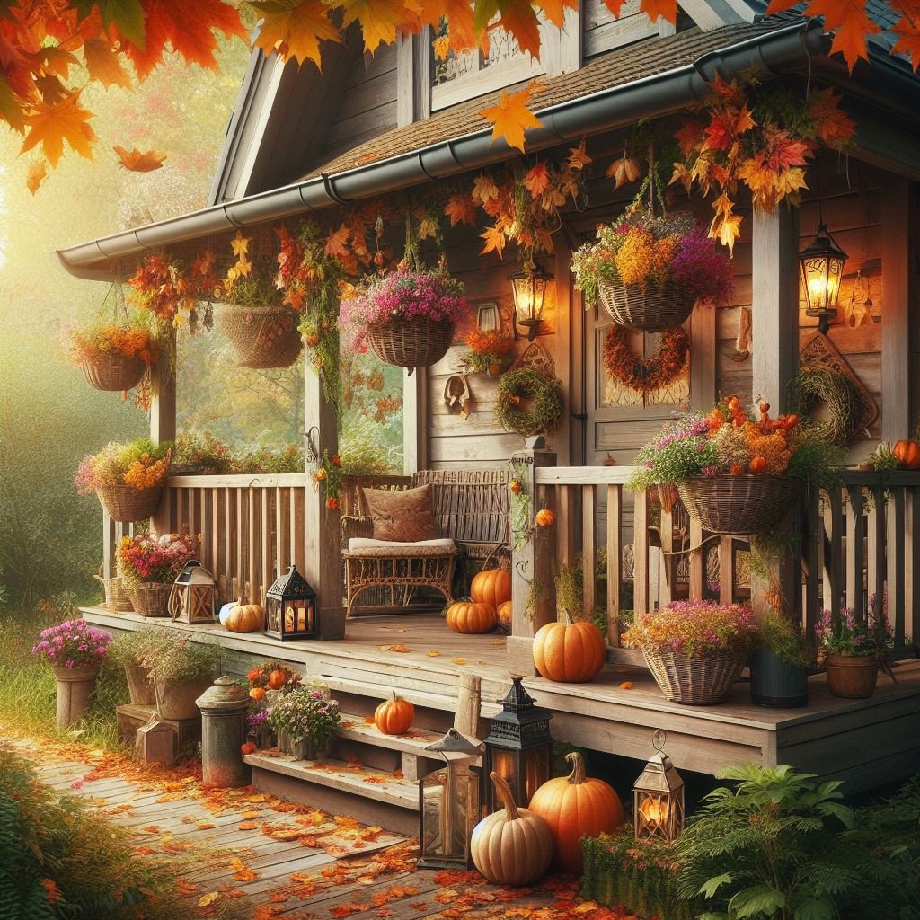
5. Landscaping and Hardscaping
Think of landscaping as your home’s supporting cast. It enhances, balances, and completes the look—but only if it matches the script.
Color coordination. Cool-toned homes benefit from silvery greens (like lavender, lamb’s ear, or ornamental grasses). Warm-toned exteriors pair well with lush greens and colorful blooms.
Texture play. Mix soft (grass, mulch, plants) with hard (concrete, pavers, stone) for contrast. Pebble beds beside structured hedges? That’s harmony.
Design Tricks for Better Color and Texture Pairing
Use the Rule of Three
Pick a base color, a secondary color, and an accent. These don’t have to be wildly different—think light gray base, charcoal trim, and a walnut-stained front door. Stick to one texture for the bulk (like smooth stucco), then add a contrasting texture in smaller doses (like a brick accent wall or wooden shutters).
Don’t Forget the Light
Exterior colors can look drastically different depending on time of day and light conditions. That moody gray might look perfect at sunset but turn icy under morning light. Always test paint swatches and material samples at different times of day before finalizing choices.
Match Intensity, Not Just Hue
If your home’s palette is muted (soft greens, dusty taupes), make sure the textures follow suit—think matte finishes, natural materials. For bolder colors (blues, blacks, whites), crisper textures like polished stone, steel, or high-gloss paint make more sense.
Common Mistakes to Avoid
Overmatching. Trying to match every element perfectly leads to a flat, one-note exterior. Let some elements contrast.
Neglecting context. Your home should reflect you—but also your surroundings. A desert-toned home with lush green landscaping might look out of place in a forested area.
Forgetting the roof. It’s more than just overhead protection—it’s part of your home’s color and texture palette. Treat it that way.
Curb Appeal in Action: A Before-and-After Thought Experiment
Picture this:
Before: A beige house with beige trim, a faded brown shingle roof, and plain concrete paths. It’s fine—but forgettable.
After: The same house is painted a cool stone gray. The trim pops in crisp white. The front door now greets you in deep forest green. The roof has been replaced with dimensional charcoal shingles, adding structure. Concrete paths are now edged with river stones and layered plant beds. Suddenly, the house feels intentional. It has a presence. And most importantly—it feels like home.
Final Thoughts
Great curb appeal isn’t about flashy makeovers or expensive materials. It’s about the relationships between color and texture. When every element, from the trim to the trellis, plays its part in harmony, the result is something that feels whole, considered, and deeply inviting.
If you’re making updates, start by observing: What textures already exist? What colors are dominant? What’s missing to bring the look together?
Then, be bold. Paint that front door. Swap out that old roof. Choose landscaping that doesn’t just fill space—but frames your home like the artwork it is.
Because when color and texture work together, curb appeal doesn’t just increase—it speaks volumes before anyone even steps inside.
Stay up to date with our latest ideas!